Most of the people that are dealing with computers have been asked to present their data visually, preferably with charts.
These charts could often include percentages, whether on the main or secondary axis. We will show how to do this in the example below.
Add Percentage Axis to Chart as Primary
For the example, let us presume that we have a loans table with the name of the loan approver, loan amount, and the percentage of each loan in a total amount:
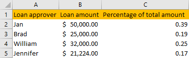
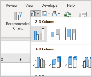
You can notice that the numbers in column C are not formatted as percentages. We will now select the populated cells in columns A and C and go to Insert tab >> Charts and choose any chart that we want, in our case 2-D Column:
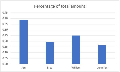
We now got a simple chart with the data for the loan approvers and percentages:
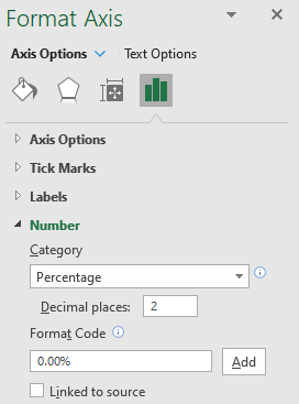
To formulate the axis on this Chart, we will simply click anywhere on the data on the left (on the numbers) and select Format Axis:
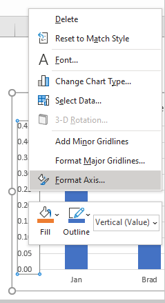
We will get a window on the right side of our screen with Axis options shown. We will click on the Numbers, then choose Percentage under Category:
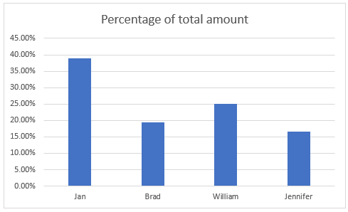
Our Chart now looks like this:
Add Percentage Axis to Chart as Secondary
The above is a fairly easy example as we had only percentages to deal with. Now we want to present all of the data we have on one chart. Luckily, newer versions of Excel are pretty helpful in this regard.
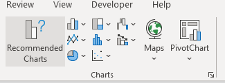
We will select our table and then go to Insert >> Charts >> Recommended Charts:
Excel is smart and will give us the best suggestions based on the data type we have:
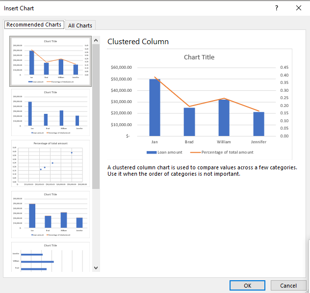
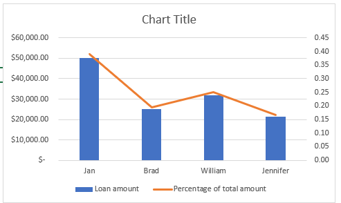
In our case the Clustered Column is the best solution, so we will click OK and will have the same chart as in the picture above created:
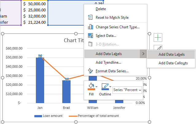
We will change the format of our right axis again and define that it shows percentages instead of numbers. Now, to show these values on the graph as well, we will click anywhere on the percentage line, right-click and then choose Add Data Labels:
Now we have our percentages on the right axis and in our chart as well:
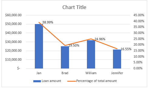
Keep in mind that numbers in the chart will always appear as they are defined in the original table, regardless of the change that we did on the axis, so we need to format these numbers as percentages on the right-side pop-up window, as we did earlier.
It is easy to have percentages on a second axis with the auto-suggestion charts. But what if we wanted to create it on a different chart type?
To do this, we will select the whole table again, and then go to Insert >> Charts >> 2-D Columns:
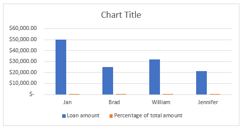
To show percentages on a second axis, we first need to click anywhere on the orange bars that we have on our graph (this is not easy in this example as they are rather small). Once we do, we will right-click on it, and then select Format Data Series:
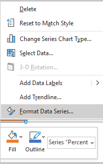
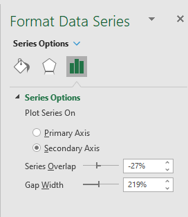
Then we will define (on the right window) that these series are moved to the secondary axis:
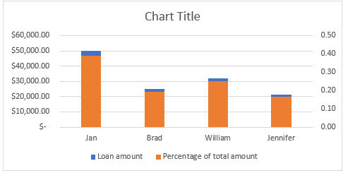
Currently, our chart looks like this:
Now we need to select the percentages (orange bar) and then right-click on it, and then click on the Change Series Chart Type option:
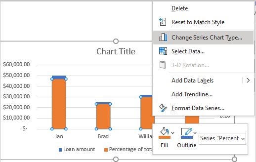
On a window that appears, we will choose Line as a chart type for percentages:
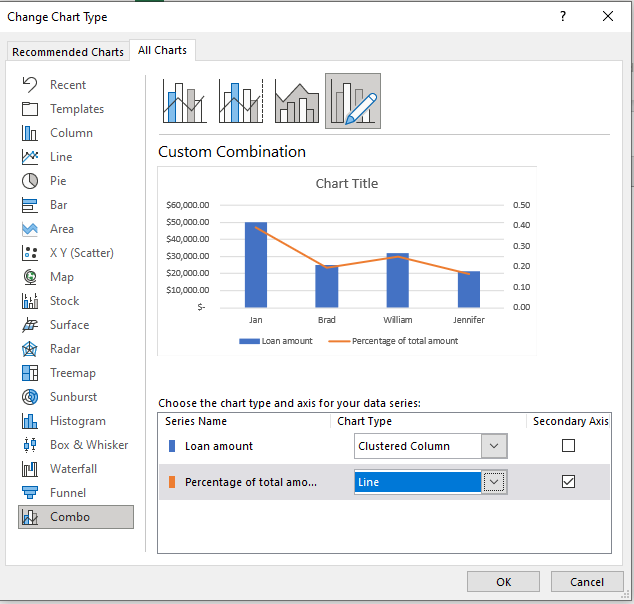
We will then click OK and have our final chart:
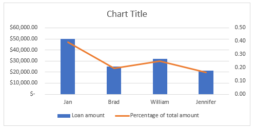
You can notice that we got to the clustered column chart type again, but indirectly this time.