Most Excel charts have two types of primary axes: the category or x-axis and the value or y-axis.
The category axis is the horizontal axis and is usually located at the bottom of the chart. The value axis is the vertical axis and is normally located on the left side of the chart.
The value axis displays numeric data plotted on a scale and the category axis shows text or dates grouped into specific categories.
After creating a chart in Excel that has the primary axes, we may need to make some changes to the axes to suit our needs, for example, the categories and the scale.
In this tutorial, we will look at different ways of customizing the category and value axes.
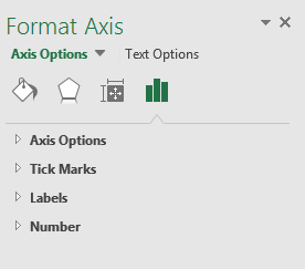
Format Axis task pane
Most of the changes we can do to the primary axes are done in the Format Axis task pane.
The task pane has 4 categories of option settings that we can use to change or customize the primary axes in Excel: Axis Options, Tick Marks, Labels, and Number:
We click on the chevron-shaped button next to the category to access the settings in the category as in the example of Axis Options below (with the category axis selected):
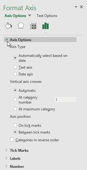
The axis options change depending on which axis we have selected.
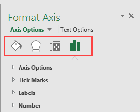
We click the small icons on top of the task pane to move to other parts of the pane with more options:
How to change the category or x-axis
When we change the category axis, we change its categories. We can also change its scale for a better display in addition to several other changes that we can make.
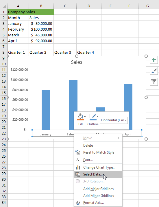
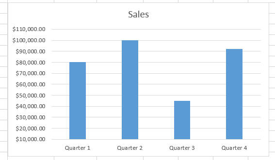
We will use the following dataset and chart to show how we can customize or change the category axis settings:

There are many settings we can change on the category axis and they include the labels of categories, axis type, and the position of the axis.
In this tutorial we will show the process of changing 2 settings: change the category range and hide labels. This process can be followed to make other changes that we may need.
Change the category range
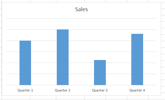
Suppose we want to change the categories of the x-axis to be quarters rather than months, we use the following steps:
- Type in Quarter 1, Quarter 2, Quarter 3, and Quarter 4 in cell A8 to cell D8.
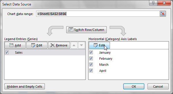
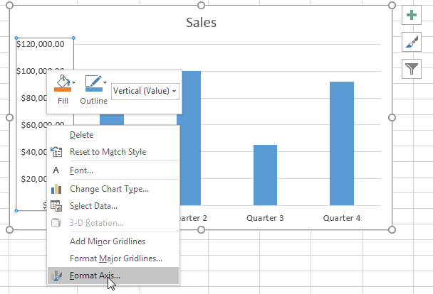
- Right-click the x-axis and click Select Data… on the shortcut menu:
- In the Select Data Source dialog box click the Edit button under Horizontal (Category) Axis Labels:
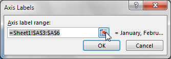
- In the Axis Labels dialog box, use the mouse to point and select and enter range A8:D8 in the Axis label range box and click OK:
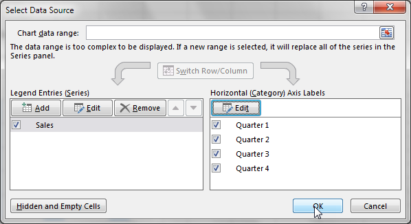
- Click OK in the Select Data Source dialog box to apply the changes:
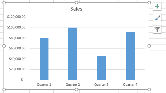
The range of the category or x-axis is changed:
Hide the labels
Suppose we want to hide the labels on the category axis. We have to use the following steps to make this change:
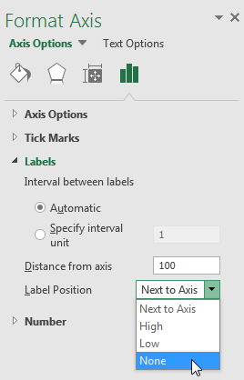
- Right-click the category axis and click Format Axis:
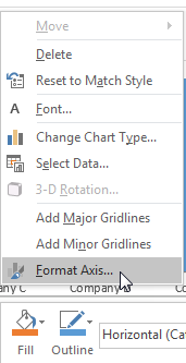
- In the Format Axis pane, click the Labels category, and in the Label Position drop-down box click None:
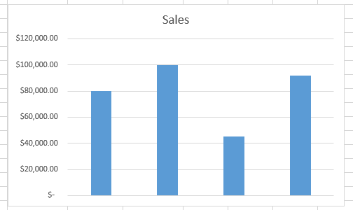
The labels on the category axis are hidden:
If we want to unhide the labels, we repeat step 2 above and click Next to Axis in the Label Position drop-down box.
How to change the value or y-axis
We can make several changes to the value axis but in this tutorial, we are going to show how we can change 4 settings: the minimum and maximum scale values, tick marks, hide and unhide the axis, and change how numbers look.
Change the minimum and maximum scale values
By default Excel automatically determines the minimum and maximum scale values of the values axis when we create a chart. We can change this to better suit our needs.
We use the following steps:
- Right-click the y-axis and click Format Axis… on the shortcut menu to open the Format Axis task pane:

- On the Format Axis pane, select Axis Options, and in the Minimum box type in the number we want:
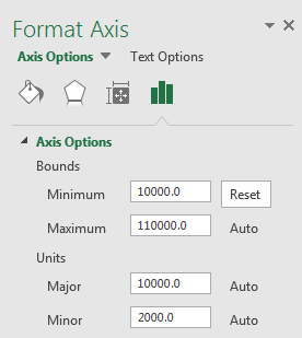
We notice that the Maximum, Major, and Minor numbers are adjusted automatically by Excel.
The chart is now displayed below:
If we don’t like the changes we can click the Reset button next to the Minimum box to go back to default settings.
Change the Tick Marks
Tick marks are used to show the major and minor divisions along the axis. We can use the following steps to change the default appearance of the tick marks:
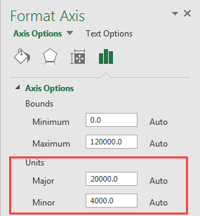
- Right-click the values axis and click Format Axis… on the shortcut menu to open the Format Axis task pane:

- Under Axis Options, in the Major box type in the number at which we want the major tick marks to be displayed. In the Minor box type in the number at which we want the minor tick marks to appear:
- In the Tick Marks category specify how we want the Major tick marks displayed by clicking the option we want in the Major type drop-down box:
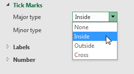
- In the Minor type drop-down box, select the option we want.
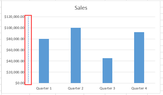
The tick marks are displayed in the chart:
We can use the same steps we have used to change the tick marks for the values axis to change the tick marks in the categories axis.
Hide and unhide the y-axis
To hide the y-axis we follow the steps below:
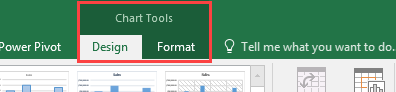
- Click anywhere in the chart to display the Chart Tools tab together with the Design and Format tabs:
- Click Chart Tools >> Design >> Add Chart Element >> Axes >> Primary Vertical on the Excel Ribbon:
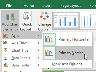
The vertical axis is hidden:
If we want to unhide the values axis, we click Chart Tools >> Design >> Add Chart Element >> Axes >> Primary Vertical on the Excel Ribbon again and the axis will be displayed.
To hide and unhide the horizontal or categories axis we need to click Chart Tools >> Design >> Add Chart Element >> Axes >> Primary Horizontal on the Excel Ribbon.
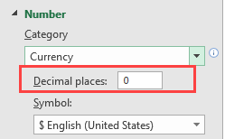
Change how numbers look
We can change how the numbers look for example in this case, we can change the number settings so the numbers are displayed without decimals.
We do the following:
- Right-click the x-axis and click Format Axis… on the shortcut menu to open the Format Axis task pane:
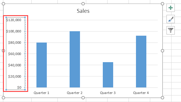
- Under the Numbers category, type in 0 in the Decimal places box:
The numbers on the y-axis are displayed without the decimal places:
Conclusion
Most Excel charts have primary vertical and horizontal axes. The vertical axis is the values axis or y-axis and the horizontal axis is the categories axis or the x-axis.
After we create a chart in Excel that has the primary axes, we may need to make some changes to the axes to suit our needs.
In this tutorial, we have looked at how we can use the Format Axis task pane and the Chart Tools tab on the Excel Ribbon to customize primary axes in Excel.