Excel’s charts are impressive, but some of the automated features in Excel may not be ideal for your specific needs. For this reason, you may want to modify some aspects of your graph manually.
For example, suppose you want to change the scale that Excel uses along the axis of a chart as the default settings may not represent all the possibilities you want to show on your chart.
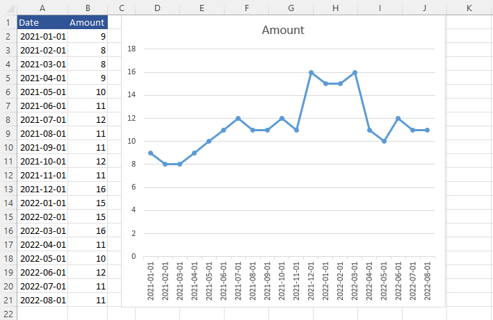
Example
This chart presents data from 0 to 18. The problem here is that there is no value smaller than 8, therefore almost half of the chart is empty. If this is your intention then you can leave it as is, otherwise, you can modify it by setting the minimum value and changing the scale.
Setting minimum and maximum values
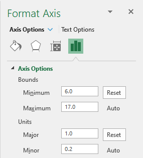
Let’s change the scale by setting the minimum value to 6. It leaves some space between the line and the bottom edge of the Plot Area.
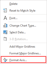
Right-click y-axis values and click Format Axis.
Inside the Axis Options tab, set minimum bounds to 6 and major units to 1. Notice that this automatically changed maximum bounds to 17. You can change that back to 18 or keep the default value.
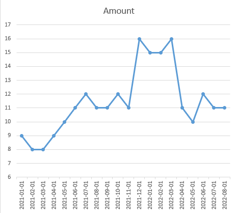
The minimum bounds and major units have been changed, so let’s see what the chart looks like.
Scaling the x-axis
You can also scale values on the horizontal axis. Even though these are dates, not numbers, you can use the same methods to modify these values.
If you think there are too many of them, you can right-click the x-axis and then Format Axis.
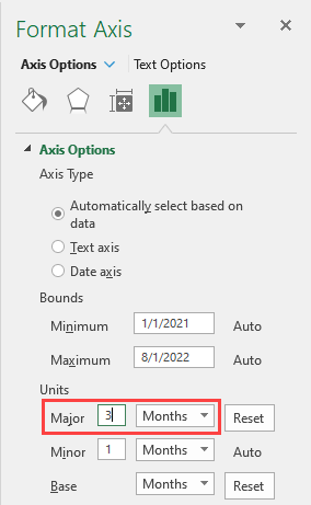
By changing the major units to 3, now every 3rd month is displayed on the chart.
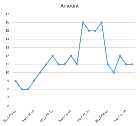
You can also scale months to years, therefore only two values on the x-axis are going to be displayed.