Sometimes you may want to create an Excel chart based on a dataset that has positive and negative numbers.
In this tutorial, we will look at how this can be achieved.
Add Helper Columns and Calculate Positive and Negative Values
Before we can plot information on a chart, we should ensure that our data is laid out correctly.
We will use the following steps to arrange our data correctly:
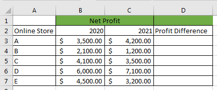
- First, add a helper column to contain the difference in profit in the two years:
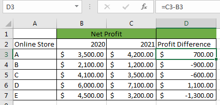
- In Cell D3 type in the formula =C3-B3 and then drag down the Fill Handle to copy the formula down the column:
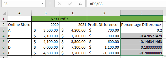
- Add another helper column to contain the increase or decrease percentage:

- In Cell E3 type in the formula =D2/B2 and drag down the Fill Handle to copy the formula down the column:
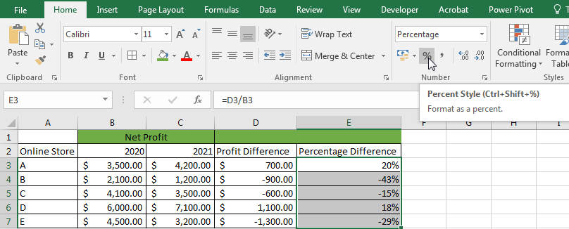
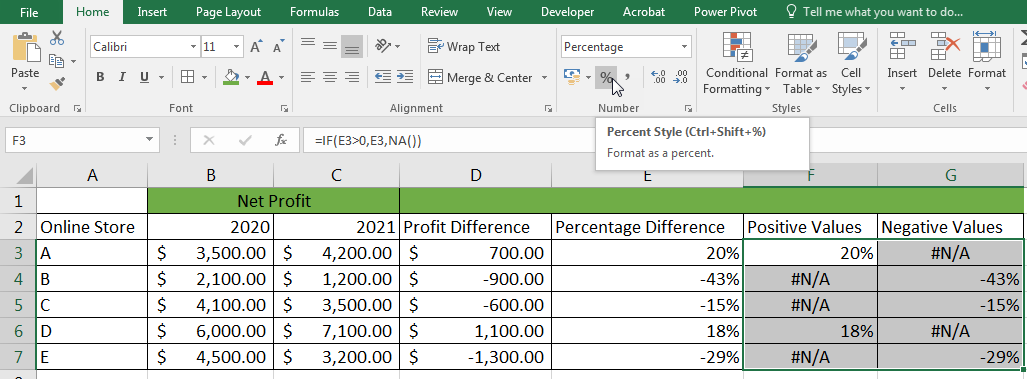
- Format the range E3:E7 as a percentage by clicking Home >> Number >> Percent Style. Alternatively, use the keyboard shortcut Ctrl + Shift + %:
- Add other 2 helper columns to contain the positive and negative values to be used in the chart:

- To calculate the positive values, select cell F3 and type in the formula =IF(E3>0,E3,NA()) and drag down the Fill Handle to copy the formula down the column:

- To calculate the negative values, select cell G3 and type in the formula =IF(E3<0,E3,NA()) and drag down the Fill Handle to copy the formula down the column:

- Select the positive and negative values and format them as percentages by clicking Home >> Number >> Percent Style. Alternatively, use the keyboard shortcut Ctrl + Shift + %:
Generate the Chart with Positive and Negative Numbers
We now create the Excel chart with positive and negative numbers by using the following steps:
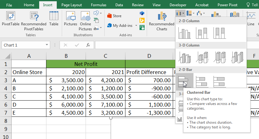
- Select a blank cell outside the dataset and click Insert >> Charts >> Insert Column or Bar Chart >> Clustered Bar:
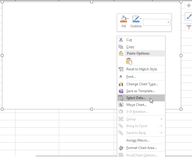
- Right-click on the blank chart and choose Select Data… from the context menu that pops up:
- Click the Add button in the Select Data Source dialog box:
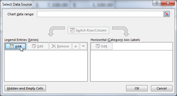
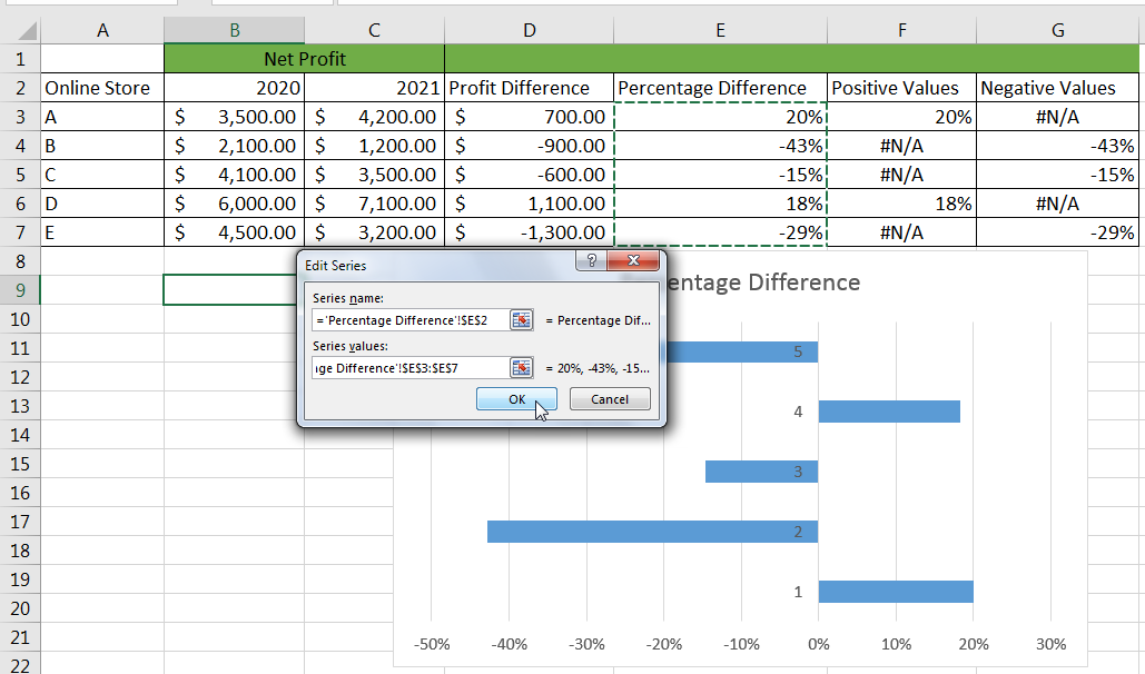
- In the Series name box in the Edit Series dialog box, choose the Percentage Difference header, and in the Series values box enter the range E3:E7 that contains the positive and negative percentages and click OK:
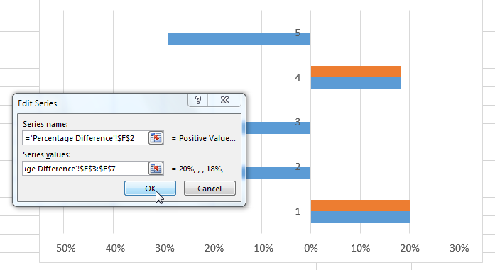
- In the Select Source dialog box that comes up again, click the Add button to launch the Edit Series dialog box again. In the Series name box enter the Positive Values header in Cell F2 and in the Series values box enter range F3:F7 and click OK:
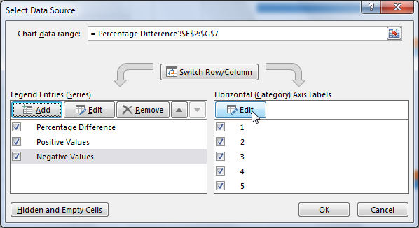
- In the Select Source dialog box that comes up again, click the Add button to launch the Edit Series dialog box again. In the Series name box enter the Negative Values header in Cell G2 and in the Series values box enter range G3:G7 and click OK.
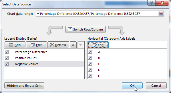
- In the Select Data Source dialog box that comes up, click the Edit button in the Horizontal (Category) Axis Labels list box:
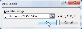
- In the Axis Labels dialog box that pops up, enter the range A3:A7 in the Axis label range box and click OK and then click OK again on the Select Data Source dialog box:
The chart is displayed:
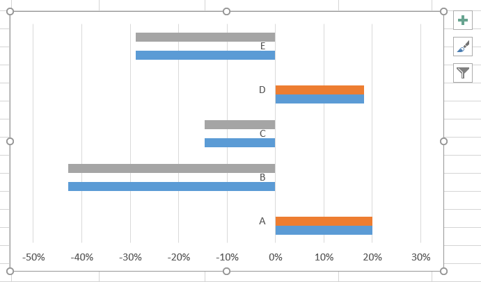
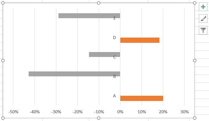
- Select and delete the blue series which show the increasing and decreasing percentage values so that we remain only with the series that express the positive and negative values:
Modify and Refine the Chart
The following are some of the things we can do to make the chart appear just the way we want it:
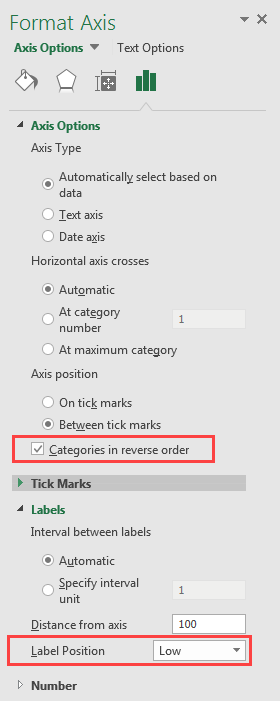
- Right-click on the Axis Labels and select Format Axis…
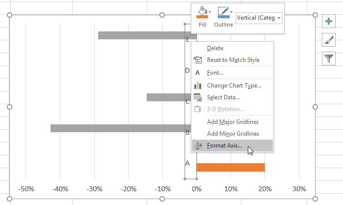
- In the Format Axis pane that pops up, check the Categories in reverse order checkbox and select Low in the Labels Position drop-down list:
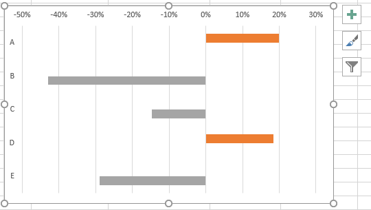
The chart will be displayed as follows with the order of categories reversed and the labels moved away from the axis:
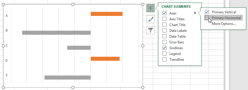
- On the chart elements remove the horizontal or the X-axis by unchecking the checkbox next to Primary Horizontal:
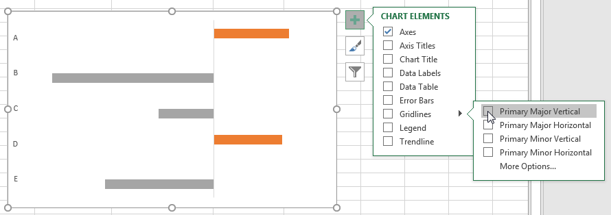
- Remove the vertical grid lines by unchecking the checkbox next to Primary Major Vertical:
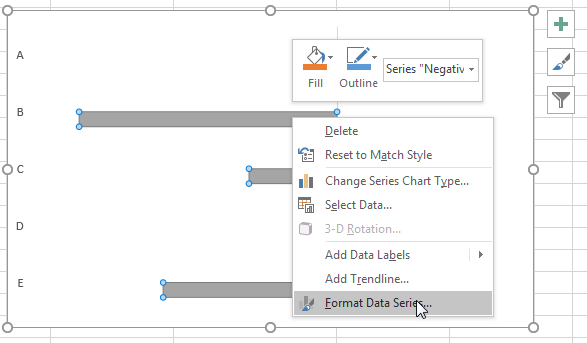
- Right-click on any data series and choose Format Data Series… from the context menu that pops up:
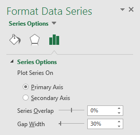
- In the Format Data Series pane, adjust the Series Overlap to 0% and the Gap Width to 30% or another percentage that suits your situation.
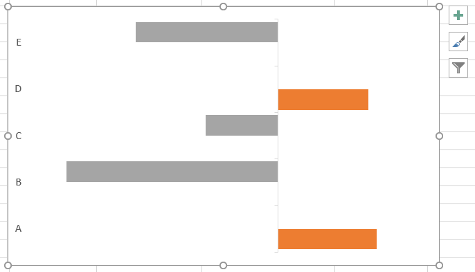
The chart now looks as follows:
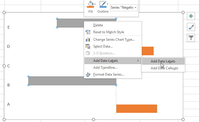
- Right-click on the negative series and click Add Data Labels >> Add Data Labels:
The negative percentage labels are displayed next to the negative series as shown below:
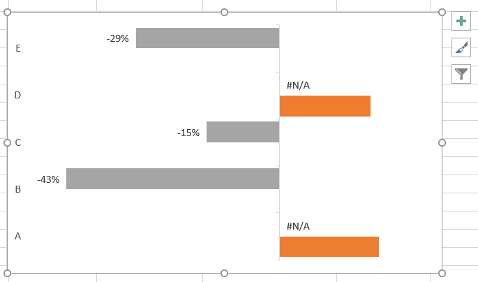
- Right-click on the positive values series and select Add Data Labels >> Add Data Labels from the context menu that comes up:
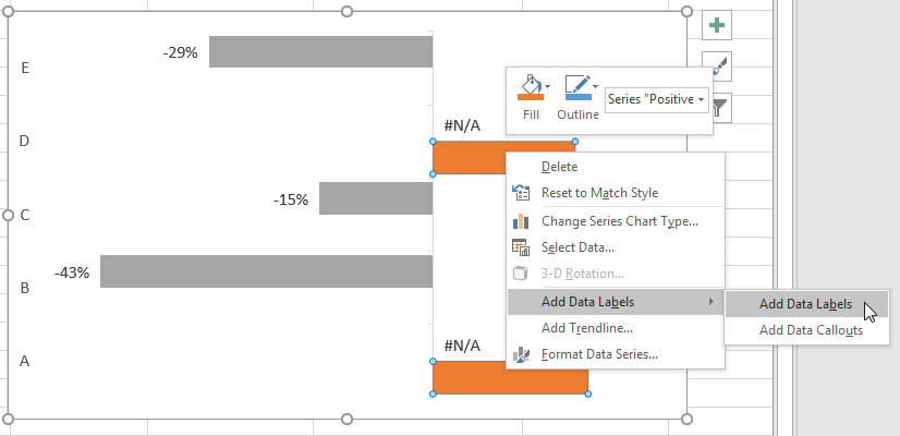
The chart now appears as below:
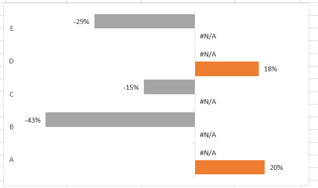
- Select each of the #N/A values and delete them so that the chart now looks as below:

- Add the horizontal grid lines by clicking Gridlines >> Primary Major Horizontal on the Chart Elements dialog box:
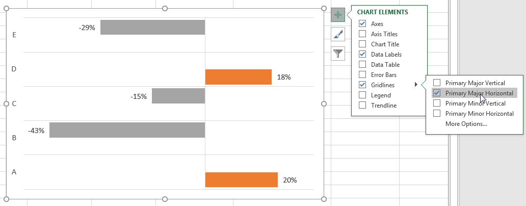
The final Excel chart with positive and negative numbers finally looks like the one below:
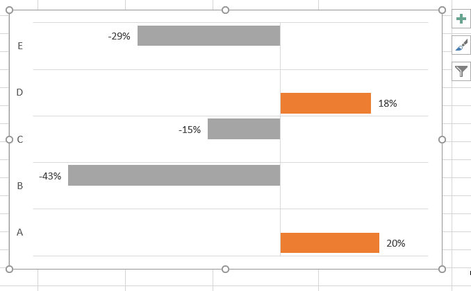
We can use the Chart Elements feature to adjust other chart elements such as adding the chart title, axes titles, legend, series colors, and so on.
Conclusion
In this tutorial, we have covered all the steps we need to take to come up with an Excel chart with positive and negative numbers.
The first step is to ensure that our data is laid out correctly. This is achieved by adding helper columns to our data set and arranging it in such a way that we have a column that contains the positive values and another that contains the negative values.
The next step is to generate the chart we want. We used a clustered bar chart in our tutorial because it is used to compare values across a few categories.
The final step is to adjust and modify the chart so that it looks exactly the way we want it.
The process of creating an Excel chart with positive and negative numbers can be challenging at first and time-consuming but it becomes easier with practice.
