An Ogive chart, also known as a cumulative frequency distribution graph, represents the cumulative distribution of a set of data. It displays the cumulative frequency of data over time or in a particular range of values. We use the chart to analyze the data distribution and identify patterns or trends.
Ogive charts help analyze datasets with a large number of values or identify the distribution of data in a population to gain insight into the distribution of data and make informed decisions based on the data.
This tutorial uses a practical example to show how to create an Ogive chart in Excel.
How to Create an Ogive Chart in Excel
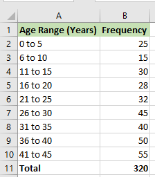
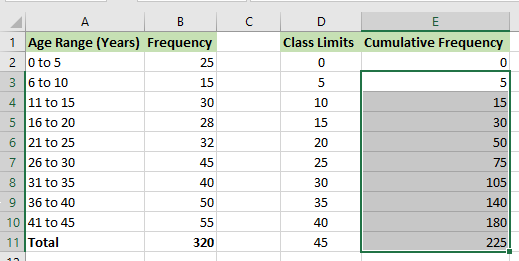
Suppose we have the following dataset showing a particular population’s age range and frequency.
We use the following steps to create an Ogive chart based on the dataset:
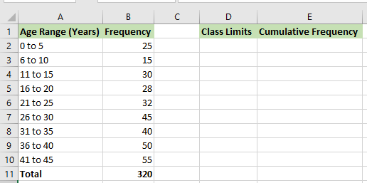
Step #1: Create Two Helper Columns Next To The Dataset
We need to create two helper columns next to the dataset to make the Ogive chart the right way.
We create one column called “Class Limits” and another called “Cumulative Frequency.”
Step #2: Fill the Two Helper Columns With Values
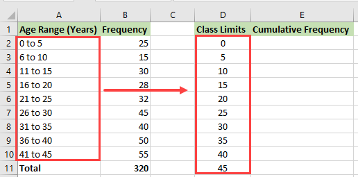
We enter into the “Class Limits” helper column numbers 0, 5, 10, 15, … up to 45 from the Age Range column.
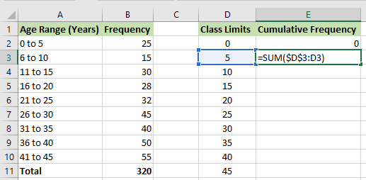
We use the following steps to enter values in the “Cumulative Frequency” helper column:
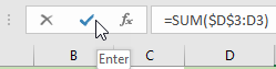
- Enter 0 in the cell E2 and type the following formula in cell E3:
|
1 |
=SUM($D$3:D3) |
Note: We use the absolute reference $D$3 in this formula so that as we copy the formula down the column, the reference does not change.
- Click Enter on the Formula bar.
- Double-click or drag the Fill Handle to copy the formula down the column.
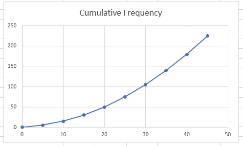
Step #3: Generate the Ogive Graph
We can now generate the Ogive chart using the steps below:
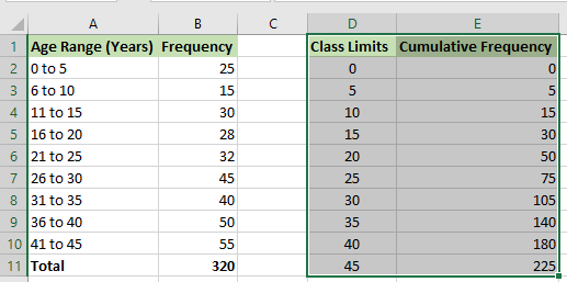
- Select the cell range D1:E11.
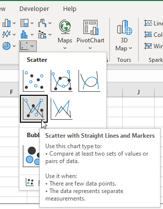
- Click Insert >> Charts >> Insert Scatter (X, Y) or Bubble Chart >> Scatter with Straight Lines and Markers.
The Ogive graph is generated immediately.
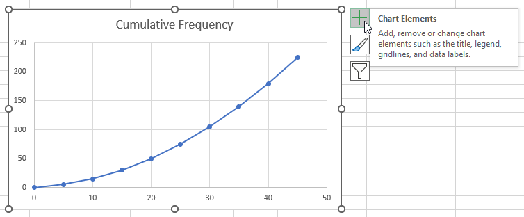
Step #4: Add Data Labels to the Ogive Chart
We need to add data labels to the graph to make it more understandable using the following steps:
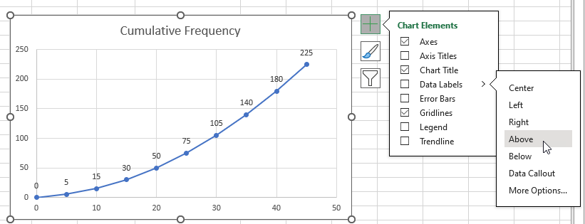
- Select the graph and click the Chart Elements button on the top right of the chart.
- Hover the cursor over the Data Labels option, click on the right arrow, and select Above, to affix the labels above the graph. Notice the preview of the labels on the chart.
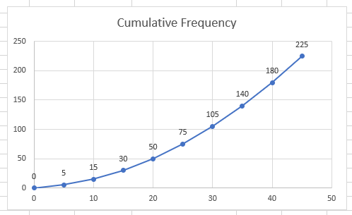
The Ogive graph is now complete.
Adjust the X-Axis and Y-Axis
We did not have to adjust the x-axis and y-axis in our chart. However, if you need to adjust these axes on your graph, use the following steps:
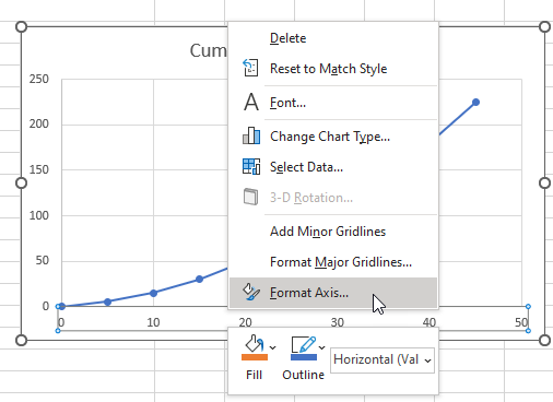
- Select the x-axis at the bottom of the graph, right-click it, and choose Format Axis on the shortcut menu that appears.
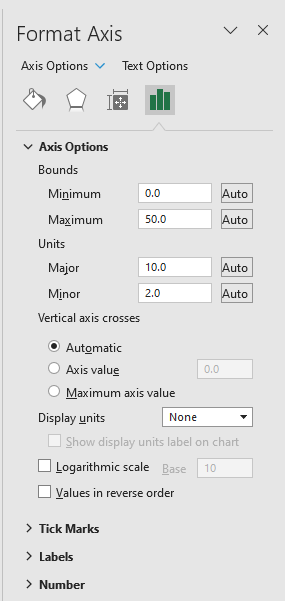
- Make changes to the Minimum and Maximum bounds and the Major and Minor units on the Format Axis pane on the right.
- Open the Axis Options drop-down at the top of the Format Axis pane and choose Vertical (Value) Axis.
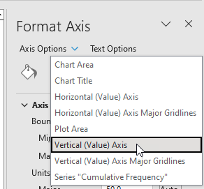
- Make the necessary changes on the Format Axis pane.
Conclusion
An Ogive chart shows the cumulative frequency of data in a particular range of values or over time. This tutorial showed how to create an Ogive graph in Excel. We hope you found the tutorial helpful.