As already discussed, options for work in Excel are limitless. It is guaranteed that nobody in this world knows everything there is to know about it. It is also a great tool for the visual presentation of the data.
We can do this with the help of the charts. What is good regarding the charts in Excel, is that we can combine them with existing formulas.
In the example below, we will show how to combine charts with the IF formula.
Create Excel Chart with the If Statement
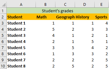
To create a chart that will be used in our example, we need to create the original table first. Our table will consist of the list of eight students and their grades in several subjects: Maths, Geography, History, and Sports.
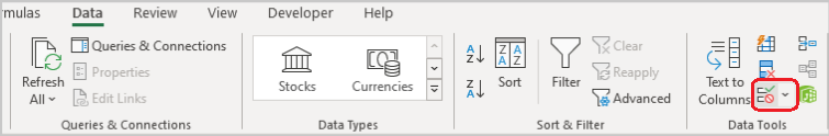
The next order of things is to copy the student’s list and then create a separate field- cell I2, where we will have a dropdown with all the subjects we have in the original table. To do this, we will select the cell I2 and then go to Data >> Data Tools >> Data Validation:
When we click on it, the following window will appear:
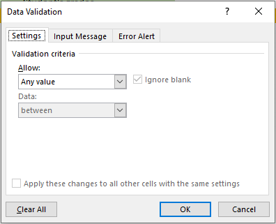
On this window, we will choose List beneath Allow, and choose a range B2:E2 as a source (this is where the list of our subjects is located):

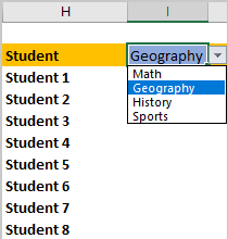
Now we have a dropdown in the cell I2:
Now we need to make sure that we show the proper results every time we select the dropdown. It is worth saying that the dropdown functions in the same way as the IF function in this case (if we select Geography we will be presented with a particular data. If we select History we will have different data and so on).
The formula that we are going to insert in cell I3 is as follows:
|
1 |
=HLOOKUP($I$2,$B$2:$E$10,ROWS($H$2:H3),FALSE) |
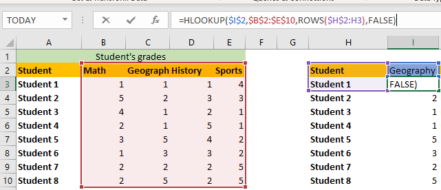
HLOOKUP is the same thing as VLOOKUP, with the difference that the data from the table_array are being searched horizontally.
The first parameter that we need to define is lookup_value. In our case, it will always be cell I2, so we lock this cell with a keyboard shortcut (F4).
Next, we need to find table_array. This part is easy, as we will select our table. We will lock these cells as well, as we do not want to change this part when dragging the formula down.
For the next thing, we want to search for row_index_num. This part is a little bit tricky, and we will use the formula ROWS to help us out. In it, we will define an array that includes cell H2 (always, that is why it is locked), and any cell in column H in the currently active row.
For the final part, we define range_lookup as false.
This is just a general overview of the formula. If you are not sure how exactly does HLOOKUP formula work, you can always look up detailed explanations, as it is not in the scope of this exercise.
All we need to do now is drag our formula to the 10th row (the final row where the data is located) and we will end up with the following table:
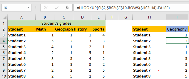
If we change the subject in cell I2 (let’s say, to Sports) we will have different data, due to our formula:
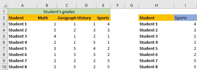
And we can see that the data for Sports in column I corresponds to the data in column E.
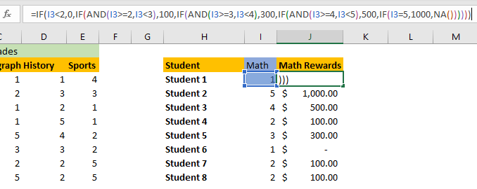
You might wonder- all this trouble, but for what? Well, now it is time to insert our IF function. We will create another column, right next to column I, where we will put a reward for students- 0$ for those who got grade 1, 100$ for grade 2, 300$ for 3, 500$ for 4, and finally, 1000$ for students that got grade 5.
The above said should be placed in the IF formula as follows:
|
1 |
=IF(I3<2,0,IF(AND(I3>=2,I3<3),100,IF(AND(I3>=3,I3<4),300,IF(AND(I3>=4,I3<5),500,IF(I3=5,1000,NA()))))) |
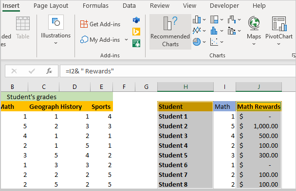
These are the results that we get:
One more thing that we did here is to concatenate the text from cell I2 with the word “Rewards”. This is the formula to do so:
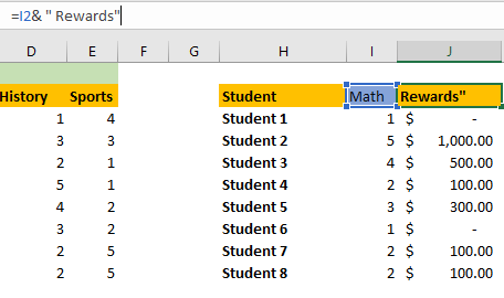
We did this so that the text would change whenever we change the subject in column I.
We will now select the data from columns H and J, and go to Insert >> Charts >> Recommended Charts:
On the window that pops up, we will choose the first chart, which is Clustered Column:
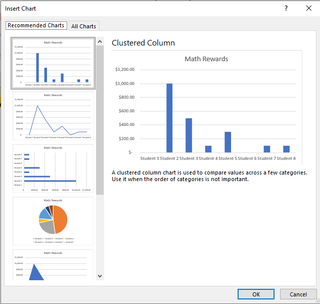
We will click OK, and have the same result as previewed:
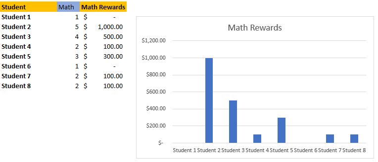
Everything we prepared till this point can finally come to fruition, as all we need to do to get the rewards for the students in any other subject is to change the subject itself in a dropdown that we have in cell I2. For example, we want to show the rewards per student for History we just choose History in this cell:
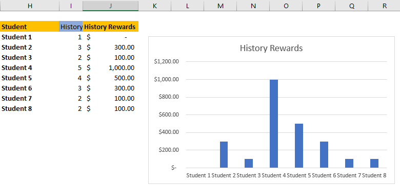
You will notice that all of the data (columns I, J, and the chart itself) immediately change once we change the subject in cell I2, which is pretty handy.