Data labels help point out information for a series of data points and make the chart more understandable. Therefore, you may want to add extra information to them to increase their value without cluttering the chart. This tutorial explains how to create custom data labels in an Excel graph.
Create Custom Data Labels Using Formulas
We can add custom data labels to a chart using formulas.
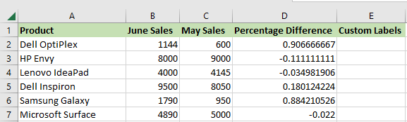
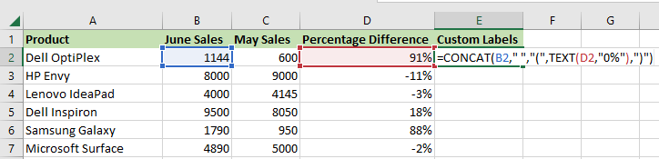
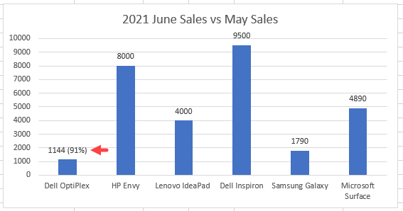
The example chart below shows the sales figures of six computer brands sold by an online store for June. The chart is based on the cell range A1:B7. Therefore, the chart shows the sales figures for June and nothing more.
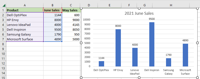
We want to add value to the chart by adding custom data labels showing the June sales figures and the percentage difference in sales from May.
We use the following steps:
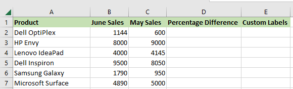
- Add two helper columns to the source dataset, the “Percentage Difference” and “Custom Labels” columns.
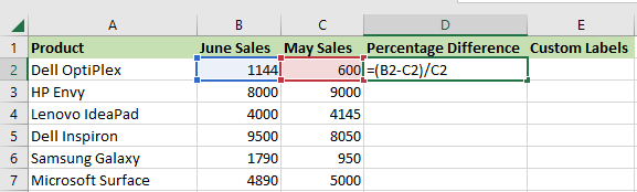
- Select cell D2 and type in the formula below:
|
1 |
=(B2-C2)/C2 |
Note: This formula calculates the difference between the value in cell B2 and cell C2 and divides the difference by the original number in cell C2.
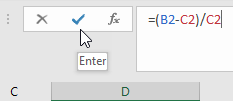
- Click the Enter button on the formula bar to enter the formula.
- Double-click or drag down the fill handle to copy the formula down the column.
To add a percentage format to range D2:D7, do the following:
- Select cell range D2:D7, right-click the selection, and choose Format Cells on the shortcut menu that appears.
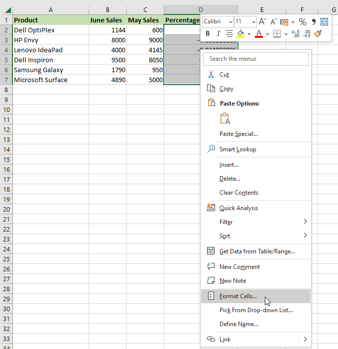
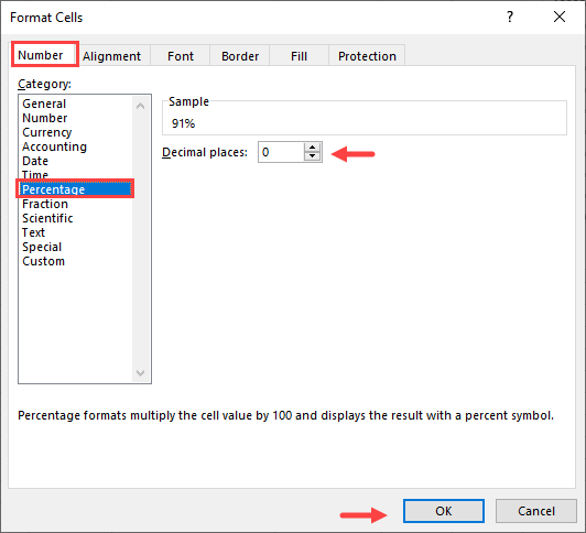
- On the Format Cells dialog box that appears, open the Number tab, select the Percentage category on the Category list box, enter zero (0) in the Decimal places spin box, and click OK.
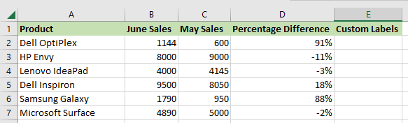
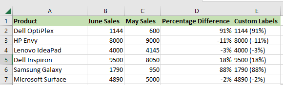
The percentage format is added to the range D2:D7.
To generate custom labels in column E, use the steps below:
- Select cell E2 and type in the following formula:
|
1 |
=CONCAT(B2," ","(",TEXT(D2,"0%"),")") |
Note: This formula uses the CONCAT function to join the June sales figures and the percentage differences between the June and May sales.
- Click the Enter button on the formula bar to enter the formula.
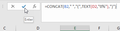
- Double-click or drag down the fill handle to copy the formula down the column.
The custom labels are displayed in column E.
Add the Custom Labels to the Chart
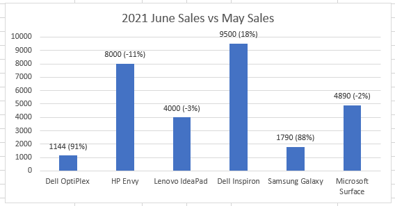
We can now add the custom labels to the chart to display the value of June sales and the difference in sales from the previous month of May.
Adding custom labels to the chart is a manual process.
We add the labels using the steps below:
- Double-click the label of the first data point showing the sales figure for Dell Optiplex to select it:

- Enter the equals (=) sign in the formula bar, select cell E2, which contains the custom label for the first data point, and press Enter.
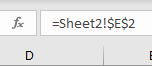
Notice that the custom label has been added to the first data point.
- Repeat steps 1 and 2 for the rest of the data points.
Conclusion
This tutorial showed how to add custom data labels to an Excel chart. We hope that you found the information helpful.