A lot of people have difficulties when dealing with charts and displaying data on charts. Properly presenting this data can help both the users and creators of the file as well.
In the example below, we will show how to display data in charts in thousands or millions.
Display Charts in Millions or Thousands
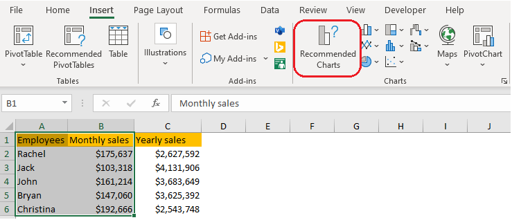
For the purposes of this exercise, we will create the table with various employees and their sales results for one random month, and yearly results as well:

For the next thing, we will create two charts, one with the figures for monthly sales (thousands), and one for yearly sales (millions).
In preparation for the first chart, we will select data in columns A and B and then go to Insert Tab >> Charts >> Recommended Charts:
On the window that appears, we will choose the Clustered Column:
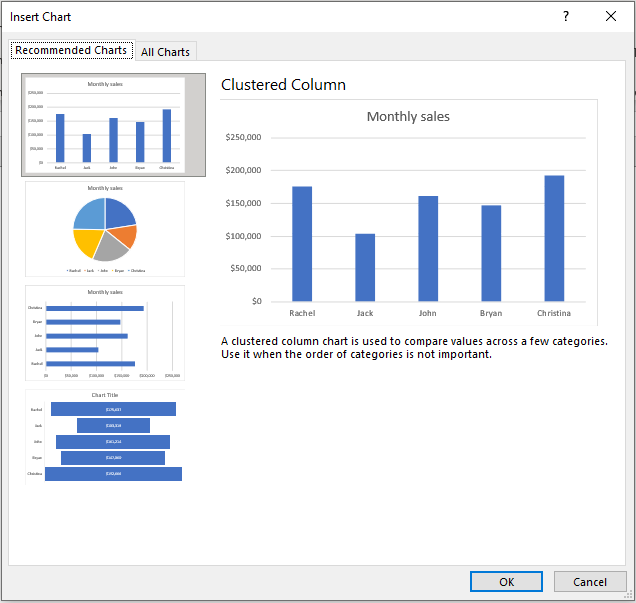
The chart we see in the preview will be exactly the same that we will get when we click OK. Now, in our chart, numbers are presented in full figures.
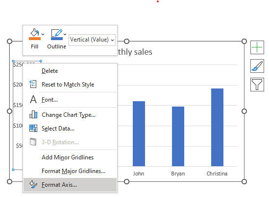
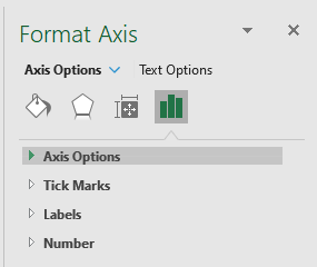
To change this, and to present the data in thousands, we will select the numbers, right-click on them and then we go to the last option- Format Axis:
When we choose this option, we will be presented with a separate window on the right side. There, we will choose Axis Options:
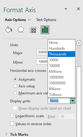
The dropdown will be expanded, and we will choose Thousands in the Display units field:
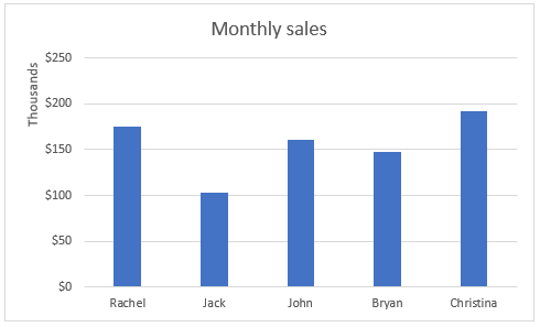
Once we do that, we will have our sales numbers presented in thousands:
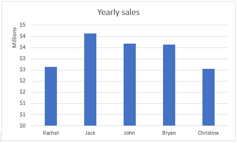
To do the same thing for millions, we will repeat the same steps, but only selecting columns A and C, of course, and millions in the Display units field:
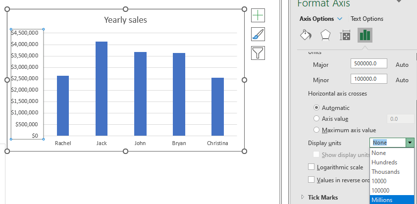
Once we choose this option, we will have our numbers nicely presented in millions: