We can make an Excel chart easier to understand by displaying data labels above the data markers or data points. This tutorial shows 3 techniques for displaying data labels above the data markers in an Excel chart.
How to Display Data Labels Above Data Markers
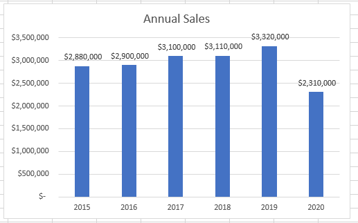
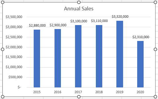
It can be difficult to understand an Excel chart that does not have data labels. For example, in our example chart below, it is difficult to tell the exact sales figures for each year shown.

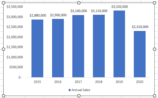
In this tutorial, we look at 3 techniques for displaying data labels above the data markers in an Excel chart. The end result will be a chart that is easier to understand as the example chart below:
Method 1: Use the Chart Elements Button
The Chart Elements button allows us to add data labels to a chart.
Suppose we have the following Excel chart that does not have data labels.

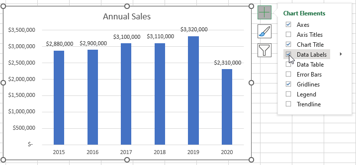
We want to display data labels above the data markers using the Chart Elements button.
We use the following steps:
- Activate the chart by clicking just below the top boundary of the chart.
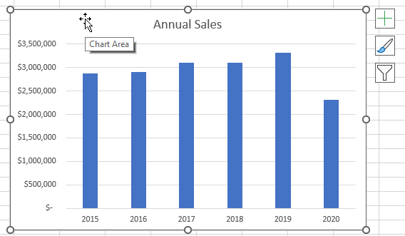
The Chart Elements button, with a green cross icon, appears at the top right corner of the chart.
- Click the Chart Elements button and check the Data Labels check box. Data labels immediately appear on top of the data markers in the chart.
Method 2: Use the Add Chart Element Drop-Down List
In this method, we use the Data Labels option on the Add Chart Element drop-down list, in the Chart Layout group on the Chart Design tab.
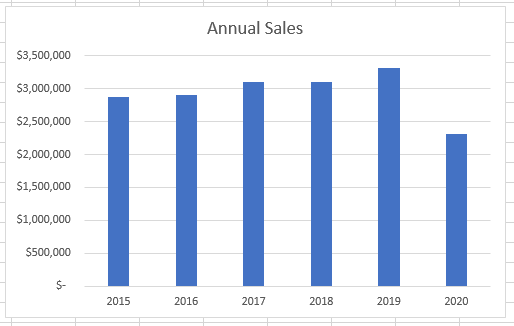
Suppose we have the following Excel chart that does not have data labels.

We want to use the Chart Design tab to add data labels above the data markers in the chart.
We use the steps below:
- Activate the chart by clicking just below the top boundary of the chart.
- Click Chart Design >> Chart Layouts >> Add Chart Element >> Data Labels >> Outside End.
The data labels appear on top of the data markers in the chart.
Method 3: Use the Shortcut Menu
In this method, we use the shortcut menu that appears when we right-click the data markers.
Suppose we have the following Excel chart that does not have data labels.
We want to use the shortcut menu that appears when we right-click the data markers to display data labels on top of the data markers in the chart.
We use the following steps:
- Right-click one of the blue data markers. The chart is activated, and all the data markers are selected.
- Click Add Data Labels on the shortcut menu and choose Add Data Labels on the flyout menu.
The data labels appear on top of the data markers in the chart.
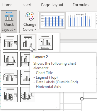
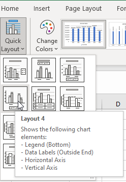
Method 4: Apply a Quick Layout
Excel has 2 predefined layouts that we can apply to our chart to display data labels above the data markers.
Suppose we have the following Excel chart that does not have data labels.

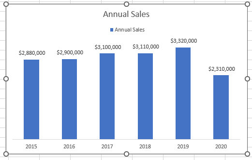
We will apply a quick layout to the chart. The layout displays data labels above the data markers.
We proceed as follows:
- Click just below the top boundary of the chart to activate the chart and the Chart Design tab on the Ribbon.
- Apply a quick layout to the chart by doing either of the following:
- Click Chart Design >> Chart Layouts >> Quick Layout >> Layout 2.
- Click Chart Design >> Chart Layouts >> Quick Layout >> Layout 4.
Conclusion
In this tutorial, we have looked at 4 techniques for displaying data labels above data markers in an Excel chart. We can use the Chart Elements button, the Add Chart Element drop-down list, a shortcut menu, or apply a quick layout.