Grouping data in an Excel chart can help us understand our data better, identify patterns and trends, and communicate our findings more effectively to others.
For example, we may have sales data for every day of the year but grouping it by month or quarter can make the chart easier to read and interpret.
This tutorial shows how to group data in an Excel chart by month and quarter and how to create a grouped vertical bar chart.
How to Group Data in Excel Graph by Month
We may want to create an Excel chart and group the data by month.
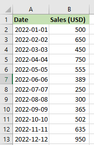
Suppose we have the following dataset showing a sample of daily sales of a particular online store.
We want to create an Excel graph based on the dataset and group the data by month.
We use the following steps:
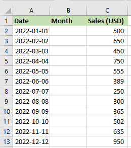
- Insert a column between columns A and B and label it “Month.”
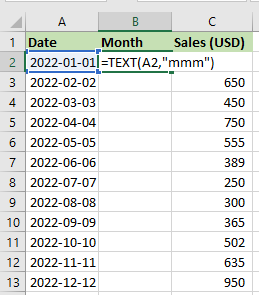
- Select cell B2 and enter the following formula:
=TEXT(A2,”mmm”)
Note: This formula uses the TEXT function to extract the month of the date in cell A2 and display it in the specified format.
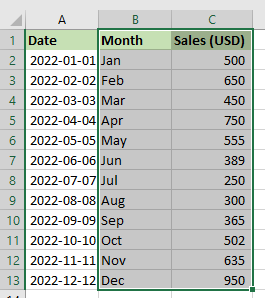
- Drag or double-click the Fill Handle to copy the formula down the column.
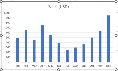
The months are shown in column B.

- Select the cell range B1:C13.
- Click Insert >> Charts >> Insert Column or Bar Chart >> Clustered Column.

The clustered column chart with data grouped by month is inserted immediately.
How to Group Data in Excel Chart By Quarters
Sometimes we may need to create an Excel chart and group the data by quarters.
Presume we have the following dataset showing the quarterly sales of a particular furniture company.
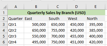
We want to create an Excel graph based on the dataset and group the data by quarters.
We use the steps below:
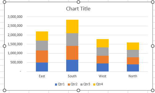
- Select the cell range A2:E6.
- Click Insert >> Charts >> Insert Column or Bar Chart >> Stacked Column.
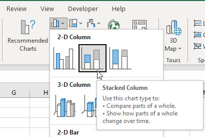
The stacked column chart is inserted into the worksheet:
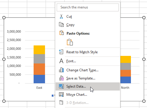
Switch the rows and columns by using the following steps:
- Select the graph, right-click it, and choose Select Data on the shortcut menu that appears.
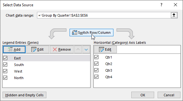
- Click the Switch Row/Column button on the Select Datasource dialog box and click OK.
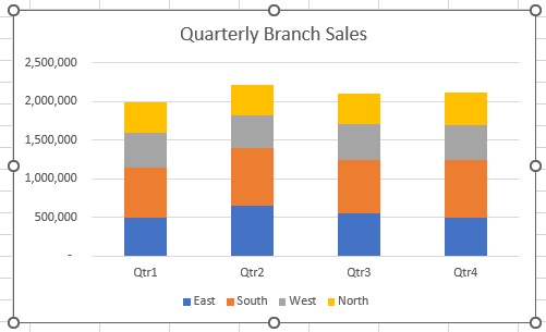
- Select the graph title and change it to “Quarterly Branch Sales.”
How to Create a Grouped Vertical Bar Chart
Suppose we want to create a grouped vertical bar graph to communicate patterns and trends in a dataset.
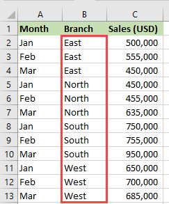
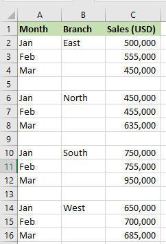
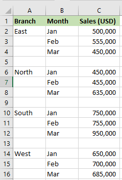
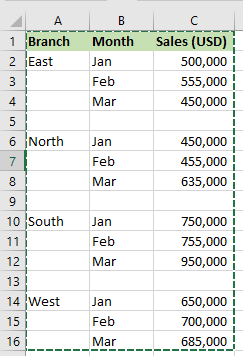
Let’s consider the following dataset showing the monthly sales of specific branches of a particular technology company.
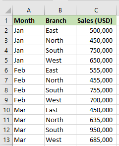
We want to create a grouped vertical bar chart based on the dataset.
Follow these steps:
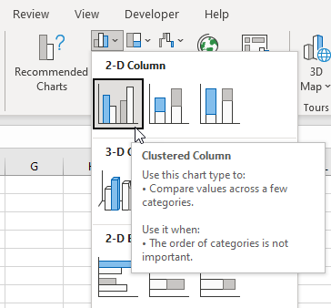
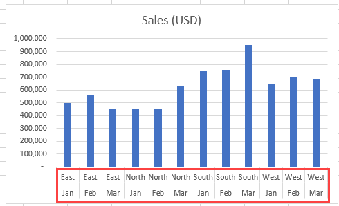
- Select the dataset and click Insert >> Charts >> Insert Column or Bar Chart >> Clustered Column.
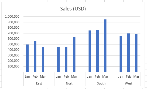
The clustered column bar chart is inserted immediately and appears as follows:
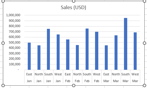
The chart displays the sales of different branches for a specific month.
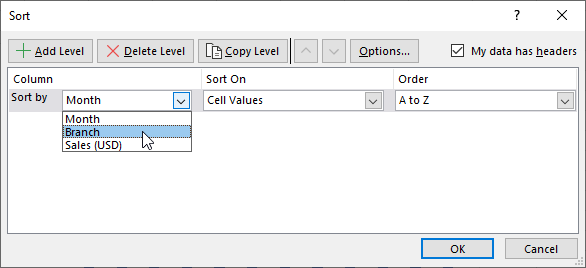
- To sort the dataset by branch, select the dataset, then click Data >> Sort & Filter >> Sort.
- On the Sort dialog box, open the Sort by drop-down, select Branch, and click OK.
The dataset is sorted by branch and appears as follows:
Notice the changes on the x-axis of the graph.
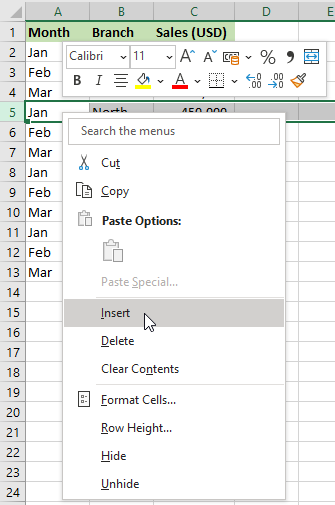
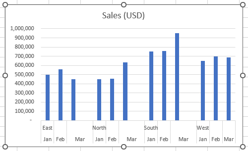
- Insert a blank row after every branch group by selecting the row below the group, right-clicking it, and selecting Insert on the shortcut menu that appears.
The dataset appears below.
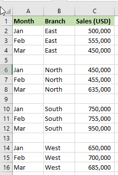
Notice the changes in the x-axis of the chart.
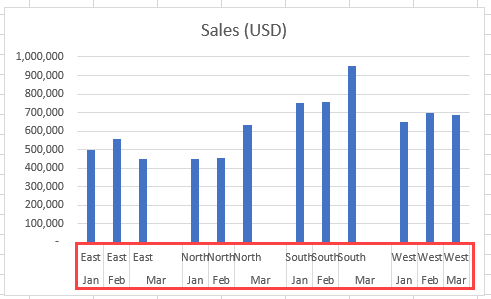
- On the dataset, retain only one branch name in every branch group and delete the others.
Observe the changes on the x-axis of the chart.
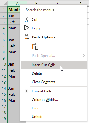
- On the dataset, switch the branch and month columns. First, select column B, right-click it, and choose Cut on the shortcut menu that appears.
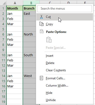
Next, select column A, right-click it, and choose Insert Cut Cells on the shortcut menu that appears.
The Month and Branch columns are switched.
Notice that the Branch column data no longer appears on the chart. To include the data, use the following steps:
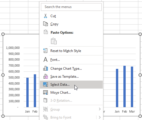
- Select the graph, right-click it, and choose Select Data on the shortcut menu that appears.
- On the Select Data Source dialog box, click the range selector button on the Chart data range box.
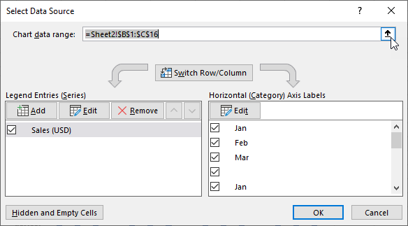
- Drag to select the entire dataset.
- Click the range selector button on the Chart data range box again to expand the dialog box and click OK.
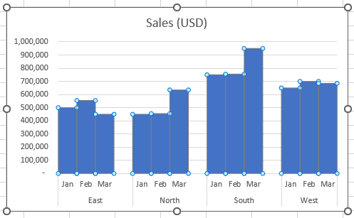
The chart appears as the following:
Format the Chart
We format the chart using the steps below:
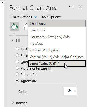
- Select the chart and press Ctrl + 1 to open the Format Chart Area pane.
- Open the Chart Options drop-down on the Format Chart Area pane and select Series “Sales (USD).”
- Click the Series Options button.
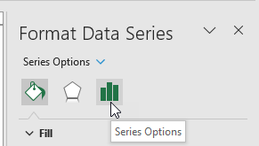
- Type 0 (zero) in the Gap Width box and press Enter.
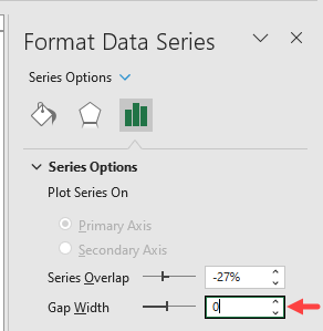
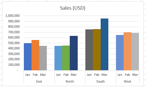
The bars of each branch category are pulled close to one another.
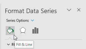
- On the Format Data Series pane, click the Fill & Line button.
- Select the Vary colors by point option.
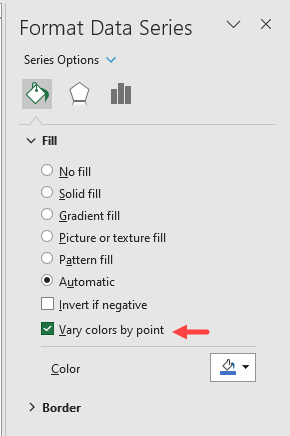
Each bar in the clustered column chart is displayed in a different color.
Conclusion
Grouping data in an Excel chart can help us comprehend our data better, detect patterns and trends, and convey our findings more effectively to others.
For example, we may have sales data for every day of the year, but categorizing it by month or quarter can make the chart easier to read and interpret.
This tutorial showed how to group data in an Excel chart by month and quarter and how to create a grouped vertical bar chart.