There are various mathematical functions and operations that can be performed in Excel.
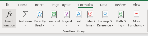
The Formulas Tab
As seen from the Formulas tab, Excel divides formulas into various groups.
In this example, we will show how to use and graphically present mean and standard deviation.
Explaining Mean and Standard Deviation
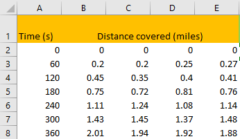
For our example, we will present the time in seconds and the distance covered in miles. Of course, these figures are random:
As you are probably aware, the mean is average in Excel, so we are going to use an average formula to get the mean results for the distance covered. The results will be as follows:
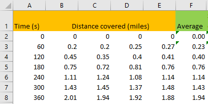
This is the simple formula that was used:
|
1 |
=AVERAGE(B2:E2) |
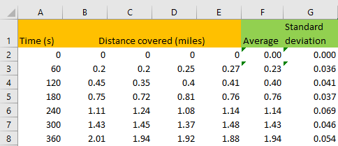
Standard deviation, by its definition, shows the dispersion of a set of data relative to its mean. In Excel, there is a formula that can easily give us the standard deviation of a set of numbers. We will input the following formula in cell G2:
|
1 |
=STDEV.S(B2:E2) |
Results for the standard deviation will look like this:
Plot Mean and Standard Deviation
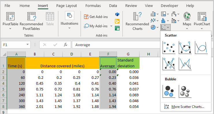
The best option for us to graphically present this data is to use a Scatter chart. To do so, we will select column A (range A1:A8), click CTRL and then select column F (range F1:F8) as well. After that, we will go to Insert >> Chart >> Insert Scatter and choose one of the options:
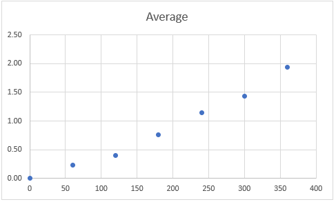
We will choose the first option, and we will end up with the following chart:
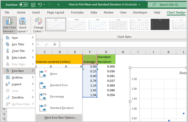
To add standard deviation to our chart, we need to click on it and then go to Chart Design >> Add Chart Element >> Error Bars >> More Error Bars Options:
Once we click on it, we will be presented with the format error bars menu on the right side of our screen:
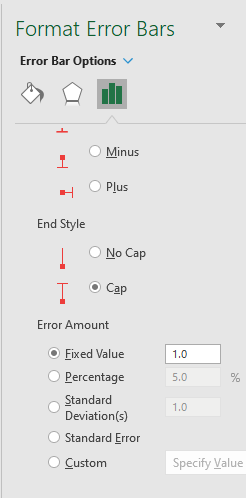
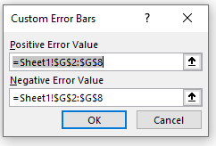
We need to click the Custom button at the end and then after that, we need to choose Specify Value.
The following picture will appear:
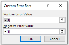
We will choose the range of our standard deviation both for Positive Error Value and Negative Error Value.
When we click OK, this is what we have for our final result:
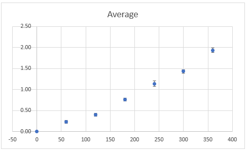
You can see that we now have our deviation shown as well as our mean. You can further edit these data in every way you want.