To create a chart you have to choose at least one column or row. But in practice charts consist of multiple columns or rows. There are a few ways you can select data for charts.
For this lesson, we’ll use the following example. In this example, we can see how many liters of fuel the car burned that day.
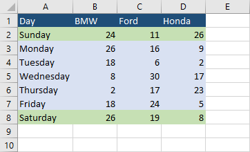
Adjacent data
If you want to select all the data, just click any cell inside the table and go to Insert >> Charts. Then select one of the charts. For this example, let’s use the column chart. This is the chart we are going to get.
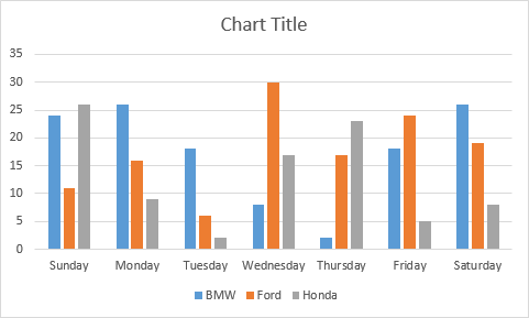
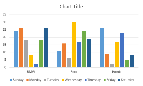
In order to switch data, click the chart and go to Design >> Data and choose Switch Row / Column.
Non-adjacent
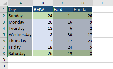
If you want to select columns only for Day, BMW and Honda, select the first range (A1:A8), then, while holding the Ctrl button, select the next range (C1:D8). Your selection should look like this.
Insert the new chart. This is the result.
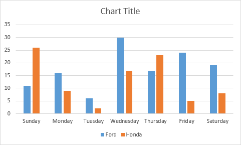
You can also do it for rows. For example, if you only want to create a chart for workweeks, you can choose ranges A1:D1 and A3:D7.
Filter
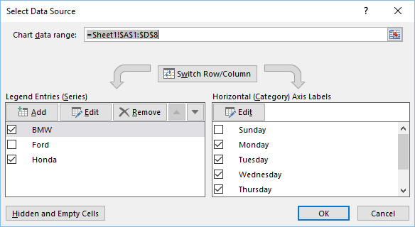
The better way to create a chart from non-adjacent columns or rows is by using the Select Data button, which you can find (after selecting chart) in Design >> Data on the ribbon.
The other way you can do it is by using the Chart Filters icon that is located to the right of the chart (after you click it).
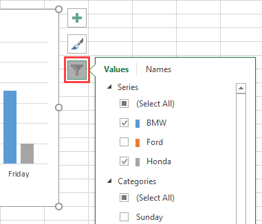
Now, instead of skipping some columns or rows, you can unselect them here. The other advantage of this method is that you can combine skipping non-workdays and Ford. You can do it also using the former method, but there is just more work because you would have to choose four ranges and the selection would look like this.
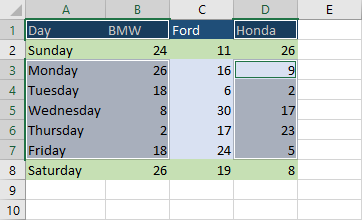
It’s more work, you can change it and it’s more error-prone. The filtering method is a better way to go.
