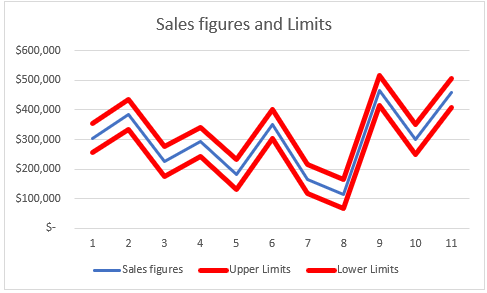
Charts in Excel are one of the best tools for visually presenting data. In some instances, we want to have upper and lower limits to our chart to see where our existing values fall in that picture.
In the example below, we will show how to do this.
Upper and Lower Limits in Excel Charts
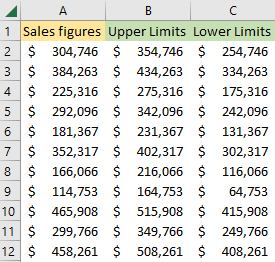
In the example that we want to create, we will create all the values manually. We will have three columns: one with sales figures, the second with upper limits, and the last one with lower limits.
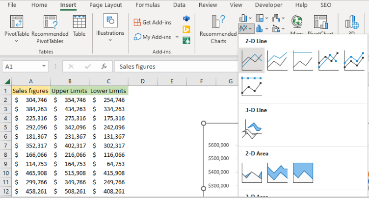
These figures are completely arbitrary. For the next thing, we will select the whole table, and then go to Insert >> Charts >> 2-D Line:
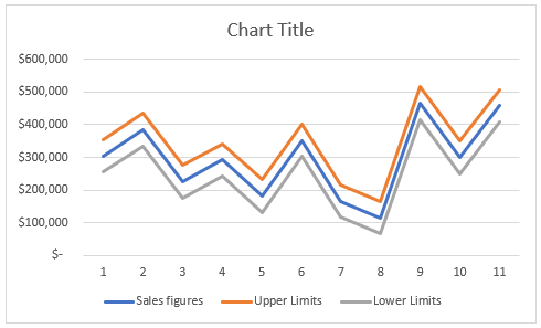
When we hover over it, we will see the preview of the chart that will be created, and once we click on it, this is what we will have:
We will change the chart title to Sales figures and Limits, then choose the upper limit line, right-click on it and then choose Format Data Series:
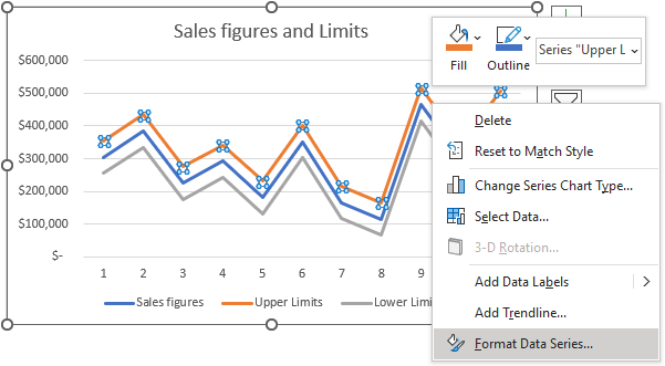
Once clicked, we will see the Format Data Series window. In there, we will choose Fill & Line option, change the color to red, and increase the width to 3.5 pt:
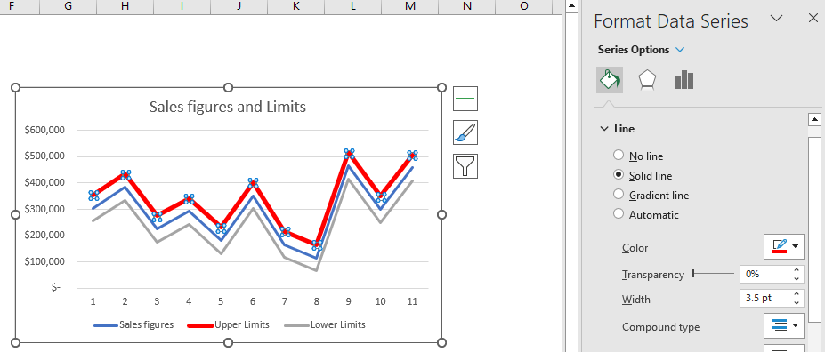
We will do the same thing with lower limits, and this is what we will end up with: