It is common knowledge that Excel is a great tool for presenting data. When we say that, we do not only mean numerical representation but graphical as well.
One of the things that can often bother people and which is not easily achieved is to show labels instead of numbers on the x-axis. We will show how to do this in the example below:
Show Labels Instead of Numbers on the X-axis
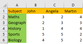
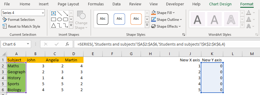
For our example, we will use the list of students with the different subjects that they attend and their marks from each subject:
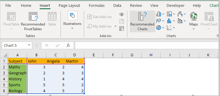
To create a simple chart, we will select our data, then go to Insert >> Charts >> Recommended Charts:
Once there, we will select Clustered Bar Chart:
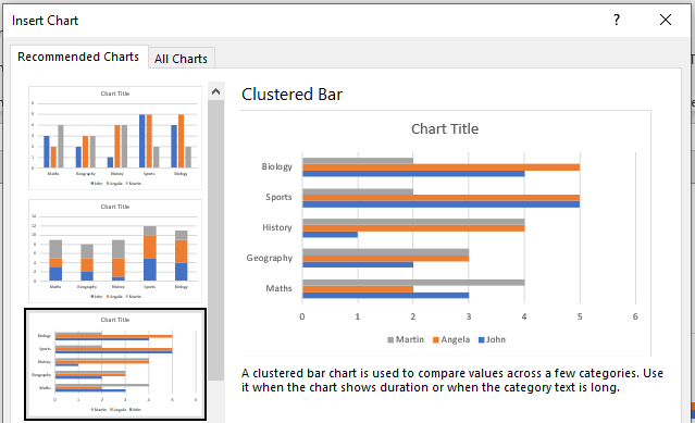
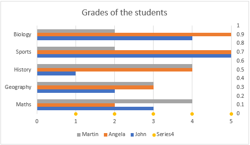
Our chart now looks the same as in the preview above:
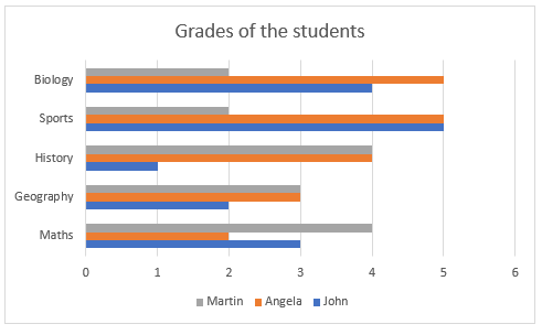
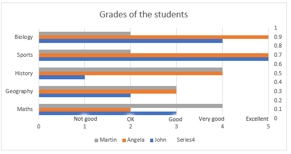
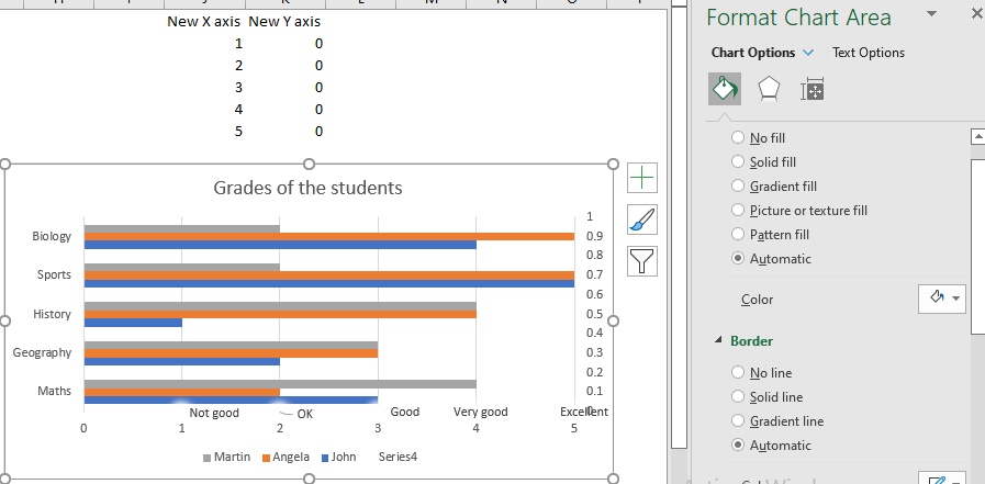
We just changed the title to be “Grades of the students”.
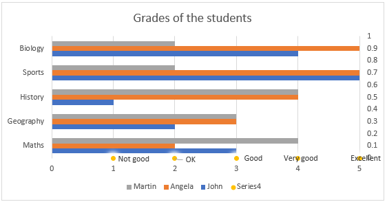
What we want to achieve now is to make the grades descriptive, in the following order: Not good for 1, OK for 2, Good for 3, Very good for 4, and Excellent for 5.
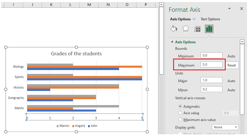
First, we will click on the numbers that we have on the X-axis and bind them to the number five since that is our maximum grade:
Now we have the tougher part. We first need to create a new X and Y axis, that will be added to the existing chart. The X-axis will have numbers from 1 to 5 and Y will have five zeroes.
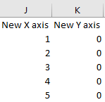
We will first add our X-axis by selecting the range J2:J6, then clicking on CTRL + C to copy it, then click on our chart and click CTRL+P to paste our selection. Our chart will have new series added now:
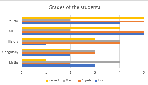
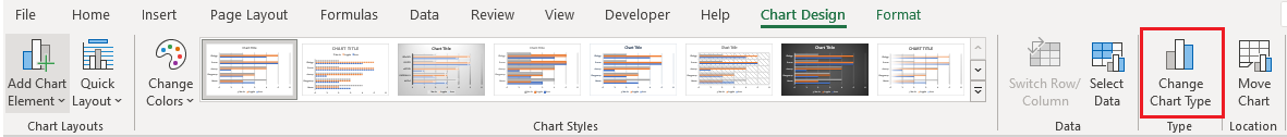
We can see that we have new series (Series 4). We will click on our chart, go to Chart Design tab >> Type >> Change Chart Type:
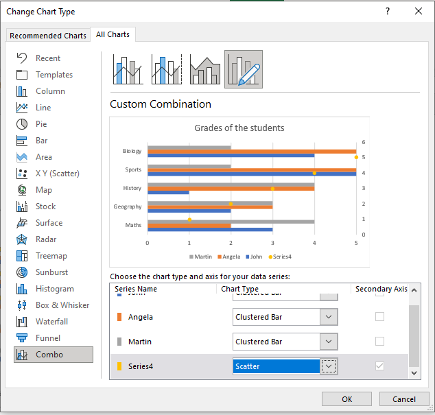
We will then choose the last option possible (Combo) and select XY scatter as an option for Series 4:
Our chart looks like this right now:
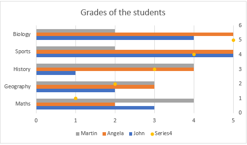
We see the little yellow dots added to the chart. For the next step, we need to change the source data for our Series 4 to be all zeroes. To do so, we will choose the options we have beneath the “New Y-axis”. The easiest way to do so is to click on the Chart, go to Format tab >> Current Selection, and then choose Series 4:
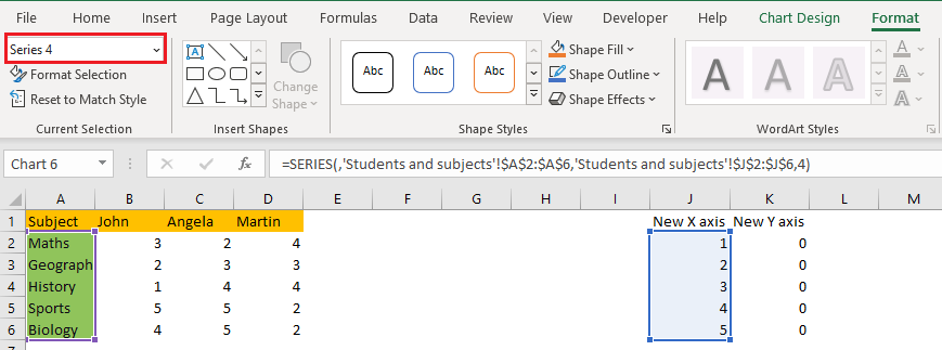
We will then simply move the series to be equal range K2:K6 instead of range J2:J6:
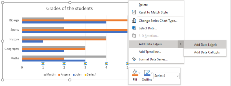
Our chart now looks like this:
Now our data points are all equal and all on the X-axis. We will select them, right-click on them and then click on Add data labels:
We will then edit every data label by clicking on it, going to the Formula bar, and then hitting the “=” sign. We will add five grades, as follows: Not good for 1, OK for 2, Good for 3, Very good for 4, and Excellent for 5. This is our chart now:
What we can do now to make this prettier is to hide our X-axis. We will do it by clicking on the series (yellow dots), and formatting the color of this series to be completely white, which will make it invisible.
We will move our marks a little bit, and finally, have our chart all ready and set: