The line chart is used to show trends in data. It usually has more data points than a column or bar chart, because it shows the change between the series, instead of comparing the individual states as bar and column charts do.
Each data series can be distinguished by using a variety of colors, styles, lines or markers.
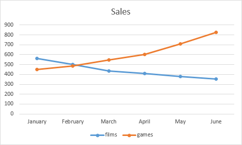
You can find seven types of Line charts in Excel: Line, Stacked Line, and 100% Stacked Line. The next three charts are the same charts with Markers. The last one is a 3-D Line chart.
3-D charts
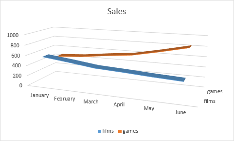
Besides the fact that the information presented in this chart has an interesting look, it is certainly not the best way to present your data because it lacks precision that the 2-D chart has.