Sparklines were introduced in Excel 2010. They are tiny graphics that look like miniature charts but occupy only one cell.
Compared to standard charts, they are much simpler– they don’t have gridlines, borders, legend, or callouts. These limitations make it more versatile than the standard charts. Thanks to their small size, you can easily fit them in the worksheet.
Using Sparklines is simple and intuitive. Remember, however, that their purpose is not to replace standard charts, but to inform about trends or patterns, giving you a quick preview of the data.
Sparkline types
In Excel 365, there are 3 types of Sparklines: Line, Column, and Win/Loss.
Line Sparkline
Similar to the line chart. It can display a marker for each data point.
Column Sparkline
This mini chart creates a series of vertical bars, one for each value. The larger columns represent higher values. It’s a mini version of a column chart.
Win/Loss Sparkline
In this chart, Excel creates a series of squares and places them in one of the two positions. If the value is positive then the square is placed at the top of the cell (Win), if it’s negative then it is placed at the bottom (Loss).
Creating a chart
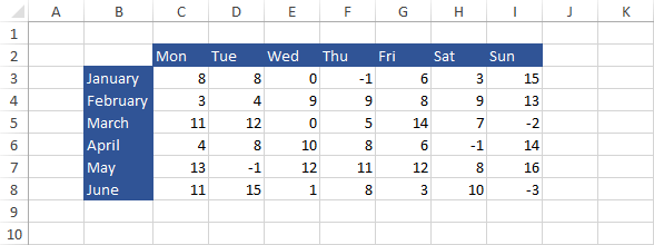
To make it easier to understand how the Sparklines work, let’s create them using the following example.

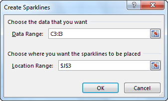
Select cell J3, then go to INSERT >> Sparklines and click the Line Sparkline. The Create Sparklines window will appear.

Select the cells that you want to be included in your chart. For this example, it will be cells from C3 to I3. After you select the cells and press the OK button, a new Sparkline will appear in cell J3.
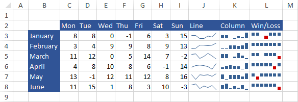
To fill the example with the rest of the Sparklines, use the AutoFill feature. In a similar way, you can insert the other two types of Sparklines.
Here is an example:

Selecting specific points
With Sparklines, you can highlight particular points. If you want to use them, click the Sparkline first and go to SPARKLINE TOOLS >> DESIGN >> Show.

You can select one or more checkboxes. After you do it, the points will automatically appear in the sparklines.
High and Low points
Highlight the highest and lowest value in the data series.

First and the Last point
Highlight the first and the last value of the series.

Negative points
Highlight all values that are lower than zero.

Markers
Highlight every data point. It works only with the Line Sparklines.

Removing Sparklines
You cannot delete a Sparkline the same way you delete regular data. To clear the contents of a cell, click it and go to SPARKLINE TOOLS >> DESIGN >> Group >> Clear.
In the drop-down menu, you have two options. The first one is Clear Selected Sparklines and the second one is Clear Selected Sparkline Group.
Excel 365 Update
- New Sparkline Types: Excel 365 offers two additional sparkline types: Box & Whisker and Area Sparkline.
- Box & Whisker: This sparkline visually represents the distribution of data within a cell, including the median, quartiles, and outliers.
- Area Sparkline: This sparkline shows the trend of data points over time as a shaded area, highlighting the overall change. (https://support.microsoft.com/en-gb/office/use-sparklines-to-show-data-trends-1474e169-008c-4783-926b-5c60e620f5ca)
- Improved Forecasting Sparklines: Excel 365 introduces the ability to forecast future trends based on existing data using sparklines. This can be helpful for predicting future values within a data series. (https://support.microsoft.com/en-au/office/create-sparklines-da9555cd-56f8-41d5-895b-2e40ac58ec50)
- Sparklines in PivotTables: As mentioned earlier, Excel 365 allows embedding sparklines directly within pivot table cells. This offers a concise way to visualize trends within the pivot table itself.
