One of the easiest methods for guessing a general trend in your data is to add a trendline to a chart. The Trendline is a bit similar to a line in a line chart, but it doesn’t connect each data point precisely as a line chart does.
A trendline represents all the data. This means that minor exceptions or statistical errors won’t distract Excel when it comes to finding the right formula. In some cases, you can also use the trendline to forecast future data.
Charts that support trendlines
The trendline can be added to 2-D charts, such as Area, Bar, Column, Line, Stock, X Y (Scatter) and Bubble. You can’t add a trendline to 3-D, Radar, Pie, Area or Doughnut charts.
Adding a trendline
After you create a chart, right-click on the data series and choose Add trendline…. A new menu will appear to the left of the chart.
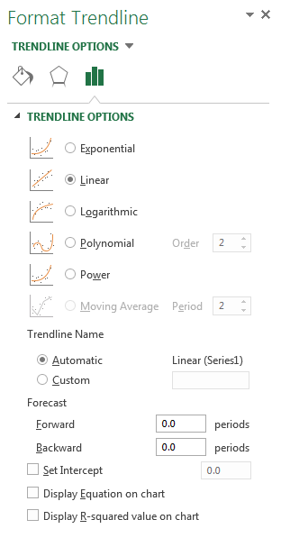
Here, you can choose one of the trendline types, by clicking on one of the radio buttons.
Below trendlines, there is a position called Display R-squared value on chart. It shows you how a trendline is fitted to the data. It can get values from 0 to 1. The closer the value is to 1 the better it fits your chart.
Trendline types
Linear trendline
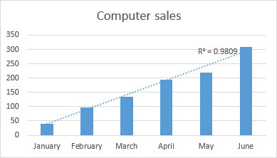
This trendline is used to create a straight line for simple, linear data sets. The data is linear if the system data points resemble a line. The linear trend line indicates that something is increasing or decreasing at a steady rate.
Here is an example of computer sales for each month.
Logarithmic trendline
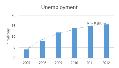
The logarithmic trendline is useful when you have to deal with data where the rate of change increases or decreases quickly and then stabilizes. In the case of a logarithmic trendline, you can use both negative and positive values.
A good example of a logarithmic trendline may be an economic crisis. First, the unemployment rate is getting higher but after a while, the situation stabilizes.
Polynomial trendline
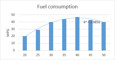
This trendline is useful when you work with oscillating data – for example when you analyze gains and losses over a large data set.
The degree of the polynomial may be determined by the number of data fluctuations or by the number of bends, in other words, the hills, and valleys that appear on the curve.
An order 2 polynomial trendline usually has one hill or valley. Order 3 generally has one or two hills or valleys. Order 4 generally has up to three.
The following example illustrates the relationship between speed and fuel consumption.
Power trendline
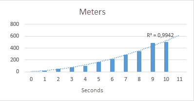
This trendline is useful for data sets that are used to compare measurement results that increase at a predetermined rate. For example, the acceleration of a race car at one-second intervals.
You can’t create a power trendline if your data contains zero or negative values.
Exponential trendline
The exponential trendline is most useful when the data values rise or fall at a constantly increasing rate.
It is often used in sciences. It can describe a population that is growing rapidly in subsequent generations. You cannot create an exponential trendline if your data contains zero or negative values.
A good example of this trendline is the decay of C-14.
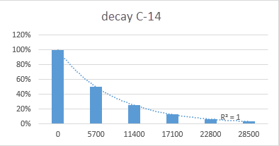
As you can see this is a perfect example of an exponential trend line because the R-squared value is exactly 1.
Moving average
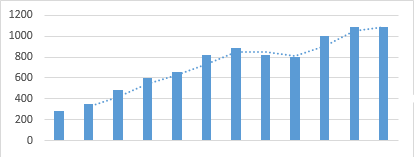
The moving average smoothes the lines to show a pattern or trend more clearly. Excel does it by calculating the moving average of a certain number of values (set by a Period option), which by default is set to 2.
If you increase this value, then the average will be calculated from more data points so that the line will be even smoother. The moving average shows trends that otherwise would be difficult to see due to noise in the data.
A good example of the practical use of this trendline can be the Forex market.
Excel 365 Update
- Minimal Functionality Changes: While the core functionalities of adding, formatting, and customizing trendlines remain largely similar, there haven’t been any significant updates or new features specific to trendlines themselves in Excel 365.
- Focus on New Chart Types: Excel 365 offers a wider range of chart types compared to Excel 2016. This provides users with more options for data visualization, which might indirectly influence how trendlines are used to analyze data. For instance, using a chart type better suited to the data might make adding a trendline less necessary.
