The best way to present our data is always visually. In Excel, there are many ways to do this, and the most famous and useful is with charts. There are many little neat tricks that can help you out in creating the best representation possible.
In the example below, we will show how you can add a line to a particular kind of chart- a Stacked Chart.
Add a Line to an Excel Stacked Chart
For the example, we will use the list of NBA players and their points from one game. We will also add the average number of points for all players, in order to create a line in our chart:

To create a Stacked Chart, we will select the data in columns A and B, and then will go to Insert >> Charts and then find this chart type:
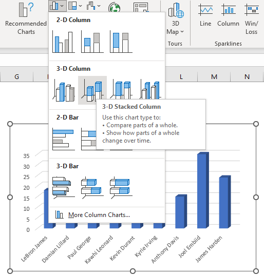
The picture above shows a preview of a chart that will be created when we choose a chart.
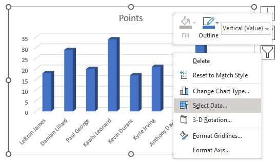
To add a line in this chart, we will right-click on it, and then go to Select Data:
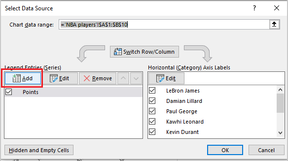
In the window that appears, we will click Add button under Legend Entries (Series):
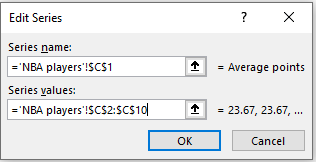
In the Edit Series window that appears, we will choose cell C1 for Series name (Average points), and under Series values, we will choose the data from column C (basically the same numbers for average points for all players).
When we click OK twice, this is the chart we end up with:

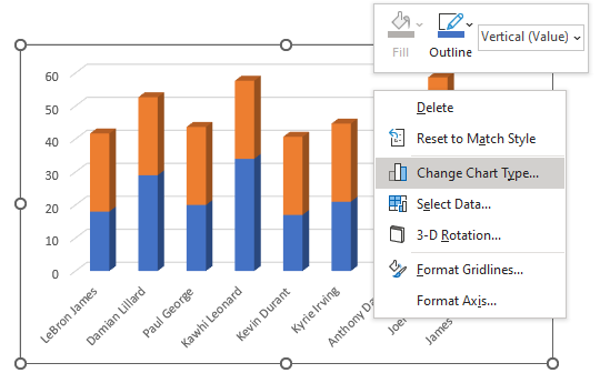
Then we need to right-click on the chart again and choose the Change Chart Type option:
In that window, we need to go and choose the last option- Combo chart, and we will choose a Line chart as a chart type for Average points:
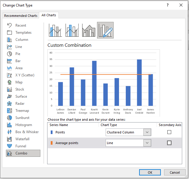
As seen in the preview, we will get the line in our Stacked Chart.