With the continuous development of Microsoft Office and Excel as its program, the options in Excel are constantly evolving.
Charts are no exception from this as well. In the example below, we will show how to add data points to Excel Charts.
Add Data Points to Excel Charts
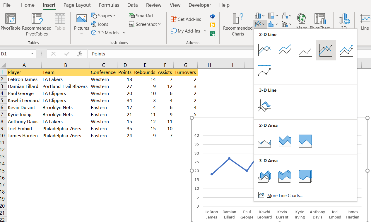
For our example, we will use the list of NBA players and their statistics from several categories: points, rebounds, assists, and turnovers:

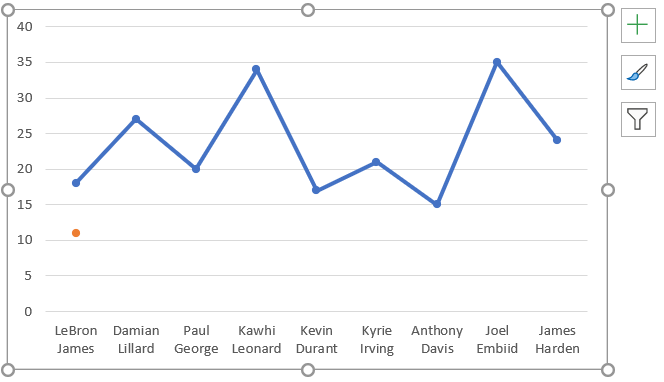
We will make the chart out of the player’s names and points, by going to Insert >> Charts and choosing the Line Chart With Markers:
We will click OK and have our chart created.
To add the data points to this existing chart, we will make these steps:
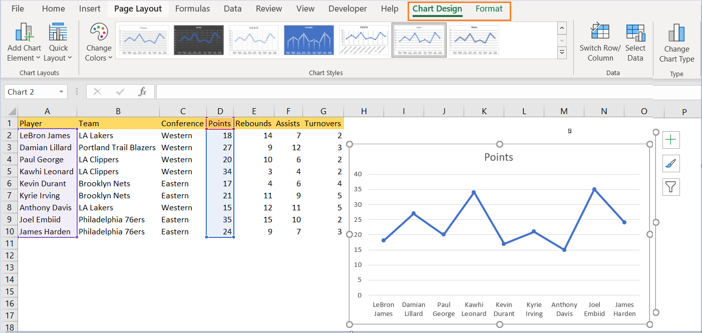
- We choose the chart that we want to edit by clicking it. When we do this, we will have the Chart Tools tab shown in our Excel ribbon:
- The second step is to click on the Select Data button that is located under the Data group in the Chart Tools tab. When we do this, the dialog box Select Data Source will be opened:
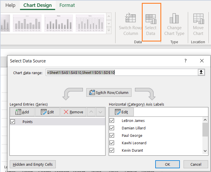
- As seen, we have Legend Entries and Horizontal Axis Labels. If we want to add a data point to our original series, we need to select the series from the section where Legend Entries is located.
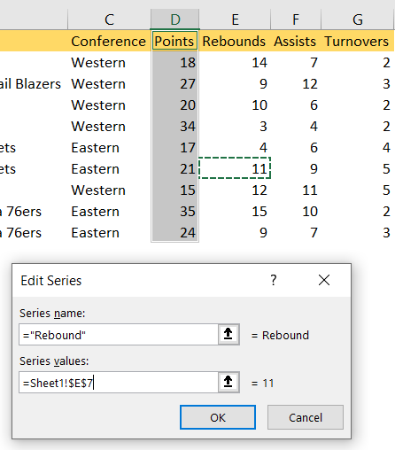
- We need to add the new series to our chart, and we will do that by clicking the Add button in the Legend Entries section and giving the series name and the data range in the dialog box that appears- Edit Series. We will write Rebound as the Series name, and choose one rebound from the column E:
We will click OK and one data point will be added: