Excel is one of the greatest tools for visually presenting the data that we have. The tools best used for this purpose are Charts and Graphs.
In the example below, we will show how to create an S Curve Graph in Excel.
Creating an S Curve Graph
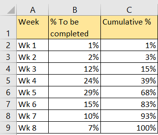
To create any type of graph, we need to input data. S Curve Graphs are usually used to present the timeline or progress of a certain activity or a project. For our example, we will use the planned data for a certain project, which will look at the progress per week, and the cumulative progress until it is completed:
There are several ways to create the S Curve Graph, out of this data:
- We can select only the data for cumulative results, then go to Insert >> Charts, and then choose the Scatter with Straight Lines and Markers among Scatter Charts:
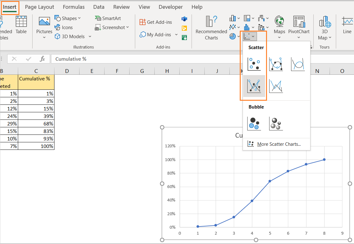
We will, as always, get a preview of our Graph. We can already see an error, i.e. that Excel shows the percentages up to 120 percent.
To resolve this, we need to click on the labels that show the percentages, right-click on it, and choose Format Axis. We will be shown with the Format Axis window on the right side of the screen, where we can determine our Maximum value:
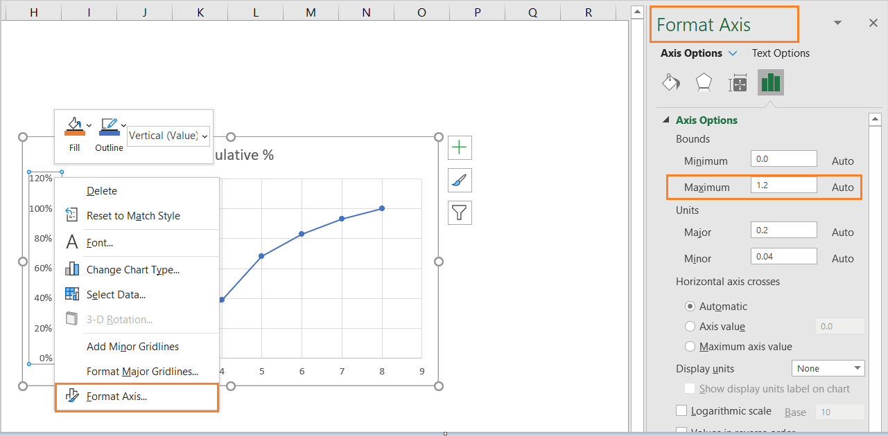
We will change this value to 1, as in for 100 percent.
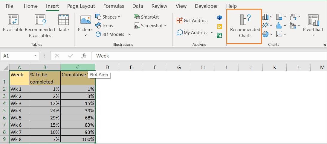
- We can select all of our data, then choose one of the Recommended Charts:
We will choose Clustered Column out of the ones that are recommended, and then we will right-click on the created chart and choose Change Chart Type:
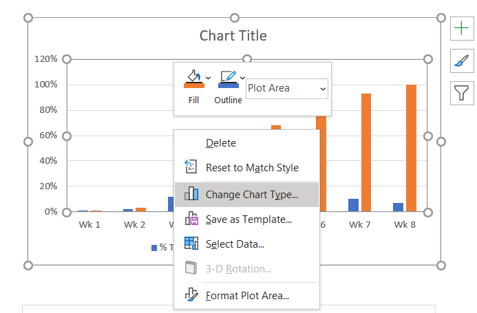
On the window that appears, we will choose a Combo chart. Once we do, we will see a nice preview of the things we want to achieve:
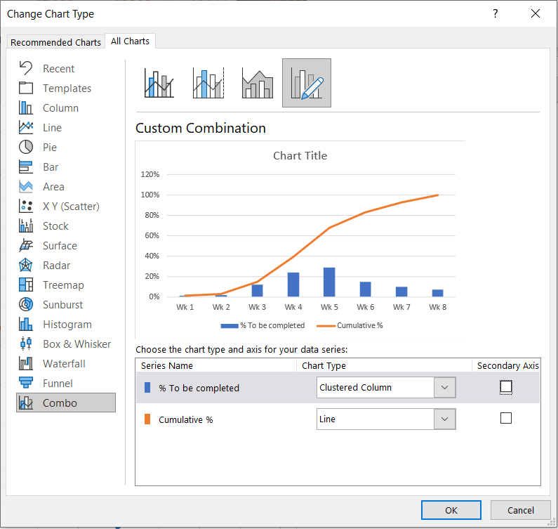
When we click OK, we will have the desired chart created: