A standard deviation chart, also known as a bell curve, is a graphical representation of the spread of a dataset. This tutorial shows how to create a standard deviation chart in Excel.
How to Create a Standard Deviation Chart in Excel
We create a standard deviation graph in Excel using the following steps:
Step #1: Compute the Average, Standard Deviation, and Normal Distribution Values of a Dataset
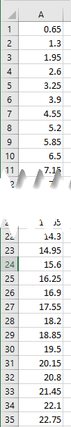
Let’s consider the following dataset showing sample scores of 35 students on a Math test.
We want to calculate the sample dataset’s average, standard deviation, and normal distribution values.
We use the following steps:
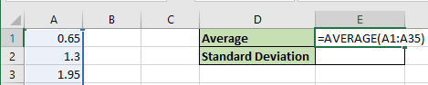
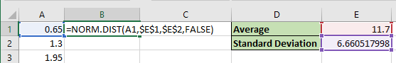
- Calculate the average of the test scores – select cell E1 and enter the following formula:
|
1 |
=AVERAGE(A1:A35) |
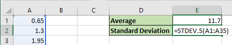
- Compute the standard deviation of the test scores – select cell E2 and enter the below formula:
|
1 |
=STDEV.S(A1:A35) |
Note: We use STDEV.S because we are using sample data. If we were using the test scores of all students who did the test, we would use the STDEV.P function.
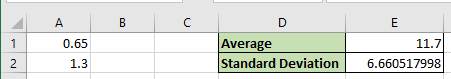
The average and standard deviation of the sample test scores appear below:
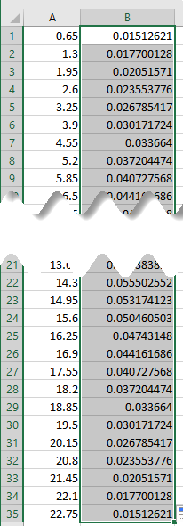
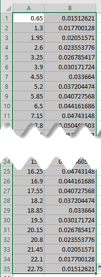
- Calculate the normal distribution of the sample data – select cell B1 and enter the following formula:
|
1 |
=NORM.DIST(A1,$E$1,$E$2,FALSE) |
Note: Use dollar signs to lock down the cell references E1 and E2 so that they do not change as we copy the formula down the column. The cells E1 and E2 contain the sample data’s average and standard deviation, respectively.
- Double-click or drag the Fill Handle in cell B1 to copy the formula down the column to get the normal distribution values.
Explanation of the formula
|
1 |
=NORM.DIST(A1,$E$1,$E$2,FALSE) |
The NORM.DIST function returns the normal distribution of a particular mean and standard deviation.
The function has the syntax shown in the image below:
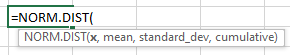
The NORM.DIST has the following four required arguments:
- x This represents the value for which we want the distribution. In this case, the value is in cell A1.
- mean This represents the average of the distribution. In this case, the mean is in cell E1.
- standard_dev This represents the standard deviation of the distribution. In this case, the standard deviation is in cell E2.
- cumulative This is a logical value determining the function’s norm. If the value is TRUE, the function returns the cumulative distribution function. If the value is FALSE, as is in this case, the function returns the probability density function.
Step #2: Create the Standard Deviation Graph
We use the sample dataset’s average, standard deviation, and normal distribution values to create the standard deviation chart using the below steps:
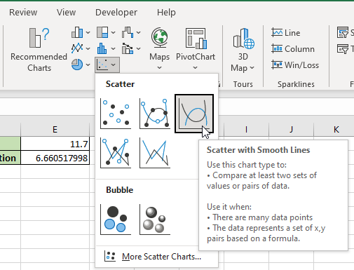
- Select the cell range A1:B35 containing the sample test scores and the normal distribution values.
- Click Insert >> Charts >> Insert Scatter (X, Y) or Bubble Chart >> Scatter with Smooth Lines.
The standard deviation chart is inserted into the worksheet.
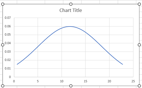
- Change the chart title to “Standard Deviation Chart.”
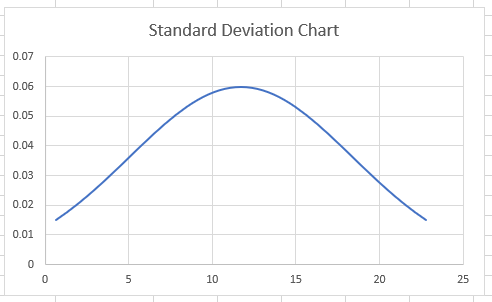
Note: The shape of the standard deviation graph depends on the standard deviation value. The higher the standard deviation, the wider the curve, and the smaller the standard deviation, the slimmer the curve.
Conclusion
A standard deviation graph, also known as a bell curve, is a visual representation of the spread of a dataset. This tutorial showed how to create a standard deviation chart in Excel. We hope you found the tutorial helpful.