Sometimes you may need to display an equation on a chart in Excel. For instance, displaying the forecasting equation on the chart can be beneficial while creating forecasts or predictions based on past data.
This tutorial shows the steps needed to display an equation on a chart in Excel.
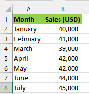
Let’s consider the following dataset that displays the sales of a specific company from January to July.
We aim to generate a chart using the provided dataset and showcase a forecasting equation on the chart. One can use the equation to predict future sales.
We use the steps below:
Step #1: Create the Chart
We use the following steps to generate the chart:
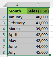
- Select the cell range A1:B8 on the dataset.
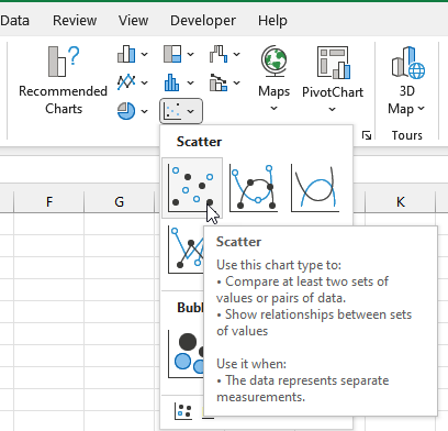
- Click Insert >> Charts >> Insert Scatter (X, Y) or Bubble Chart >> Scatter.
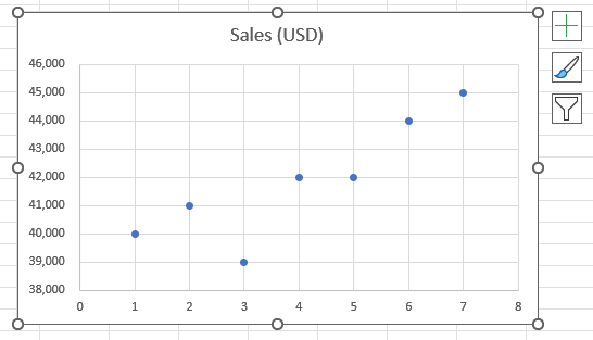
The following scatter graph is inserted into the worksheet:
Step #2: Add a Trendline to the Chart
On a chart, a trendline depicts the overall direction or pattern of the data. It’s useful for visually assessing and forecasting trends in the data.
We use the following steps to add a trendline to the chart we created in Step #1:
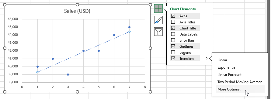
- To open the Format Trendline task pane, select the graph, click the Chart Elements button with a plus sign icon on the top left corner of the chart, click the right arrow on the Trendline option, and select More Options on the flyout menu:
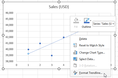
Alternatively, you can open the Format Trendline task pane by selecting the Trendline option checkbox, right-clicking the trendline, and choosing Format Trendline on the context menu:
The Format Trendline task pane is displayed on the right of the Excel window:
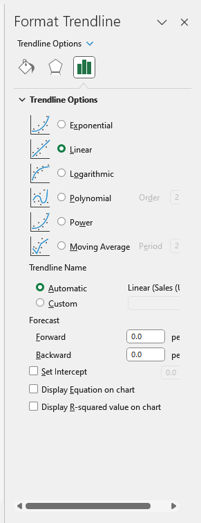
- On the Format Trendline task pane, choose the type of trendline you want, for example, Linear or Exponential. In this case, we go with Linear, the default option.
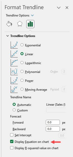
Step #3: Display Equation on the Chart
To display an equation on the chart, use the step below:
Select the Display Equation on chart option at the bottom of the Format Trendline task pane:
The equation is displayed on the graph shown below:
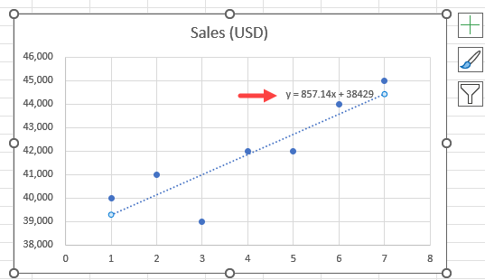
Note: The equation generated will depend on the type of trendline selected. In this instance, a linear equation was obtained as we chose a linear trendline.
Conclusion
This tutorial showed the steps needed to display an equation on a chart in Excel. We hope you found the tutorial helpful.