Like most programs, Excel allows us to correct our mistakes or edit the work that we do. That applies to everything that we are working on in Excel. Charts are not an exception.
In the example below, we will show how to edit axis labels in Excel.
Edit Axis Labels in Excel
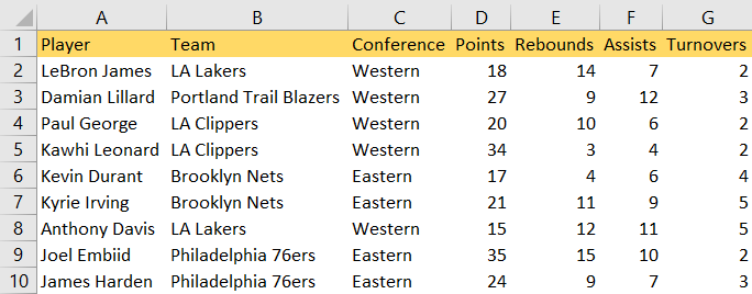
For our example, we will use the list of NBA players, and their statistics from several categories: points, rebounds, assists, and turnovers:
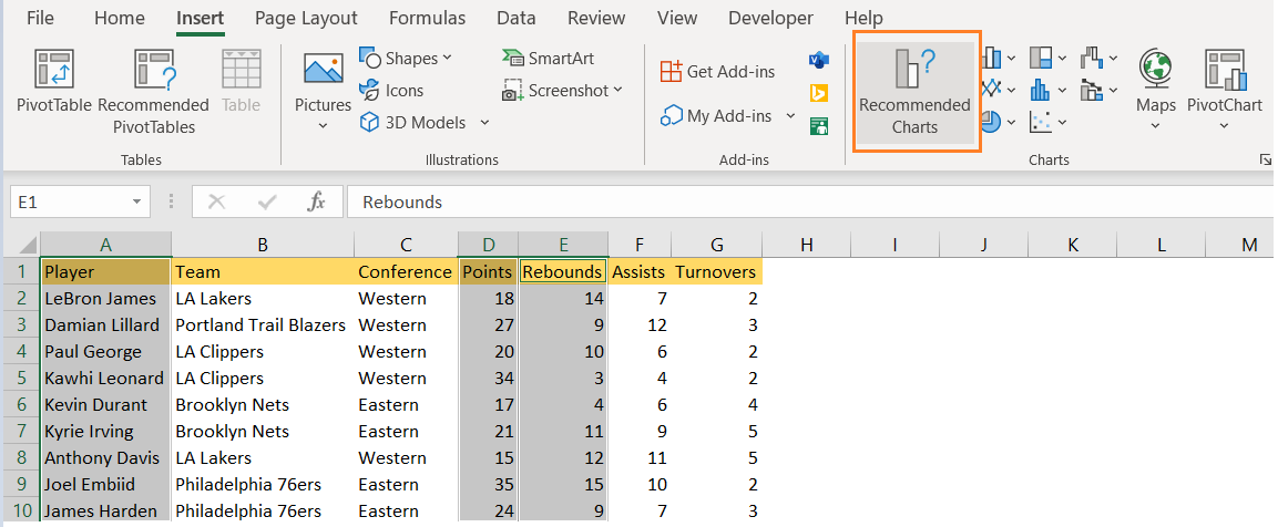
We will create our chart by selecting players, points, and rebounds (columns A, D, and E) and will get Insert >> Charts and choose any chart from the Recommended ones:
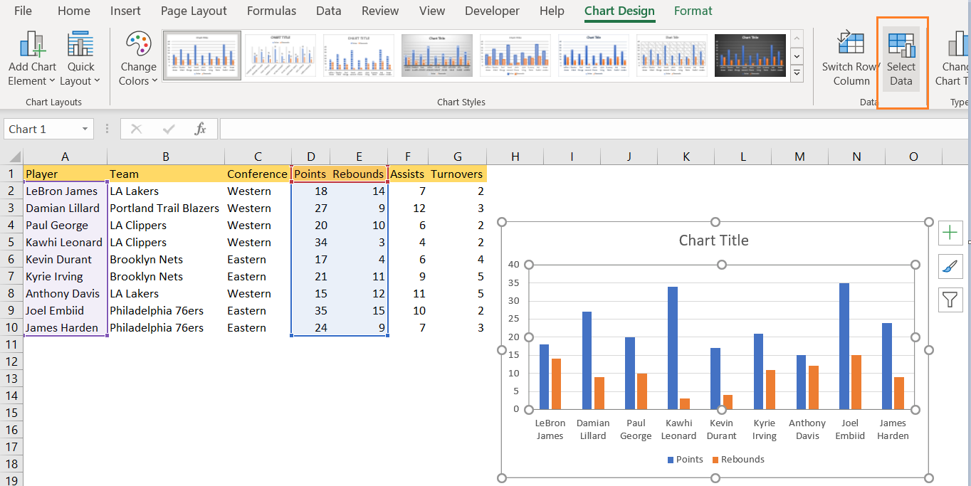
We will end up with Clustered Column. To edit the axis labels, we will select the chart, and then two more tabs will appear (Chart Design and Format) click on Chart Design >> Select Data:
You can just open your Excel spreadsheet and select the chart you want to edit. When we do that, we will be presented with the Select Data Source dialog box:
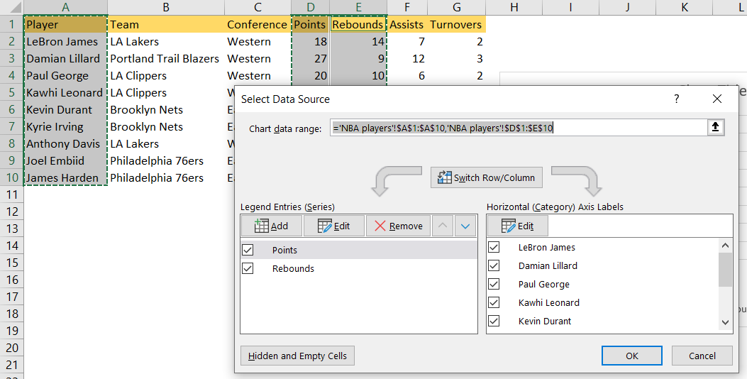
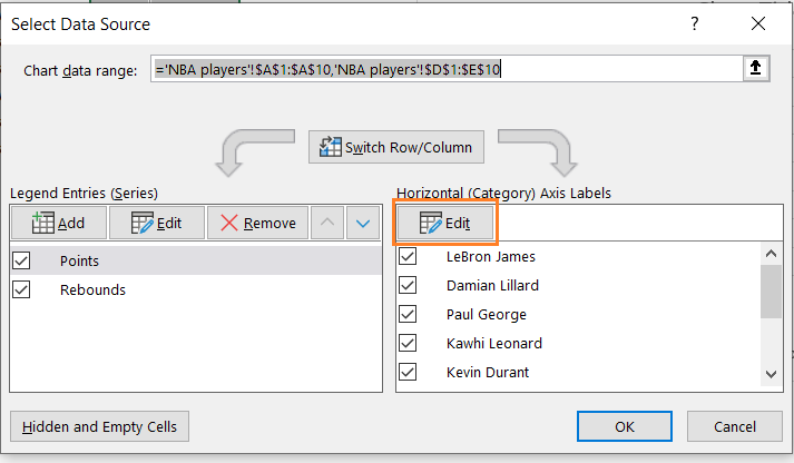
On the right side, we will have Horizontal (Category) Axis Labels, that can be changed by simply clicking the Edit button above it:
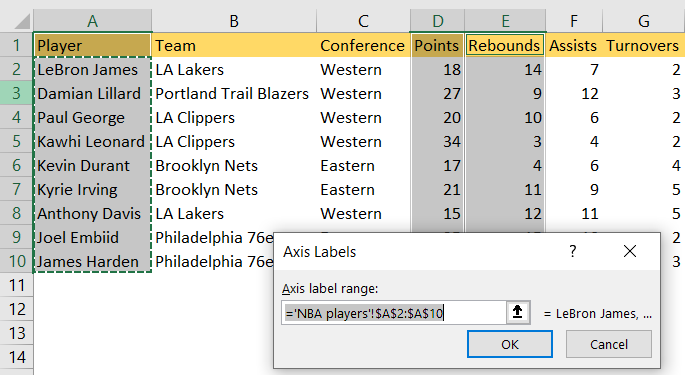
After that, we can select any range that we want:
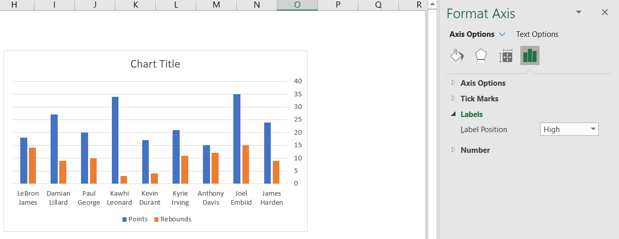
The second thing that we can change in terms of labels is that we change its position. We will choose the label to do this, and then the Format Axis option will appear on the right side. There, we will choose Label Position:
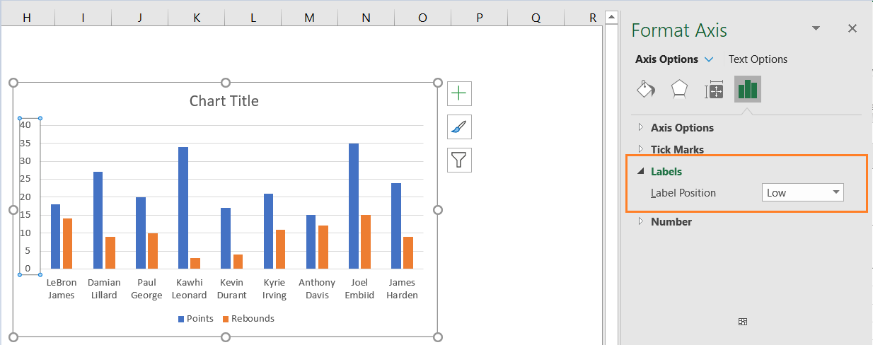 As seen, in the current setup, the label position is Low. In the dropdown, the options are: Next to Axis, High, Low, and None.
If we choose, High, for example, this will be the look of the label in our chart: