There are a lot of things that Excel is an amazing tool to use for. One of these things is data analysis, and as a part of it, linear regression. There are many definitions of linear regression. This is a statistical method that is used to model the relationship between one dependent variable (Y) and one or more independent ones (X).
Excel has a great built-in tool for linear regression, which is called “Regression”. In the example below, we will show how to do it.
Preparing Data Analysis
Several steps need to be taken to conduct a linear regression analysis in Excel:
- Prepare the Data
First thing first, we need to have our data. This means that we have a dependent variable (Y) and one or more independent variables (X) in our columns. Every row that we have should represent an individual data point.
- Enable Data Analysis ToolPak (if not already enabled)
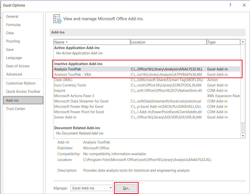
To make sure that you can do the proper Data Analysis, you need to enable Data Analysis ToolPak. To do this, you need to go to File >> Options >> Add-ins. There, in the Add-ins window, we will select Excel Add-ins and click Go:
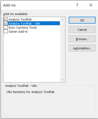
Once we do, the Add-ins window will appear. There, we will click on the Analysis ToolPak box, and click OK:
- Access Data Analysis ToolPak
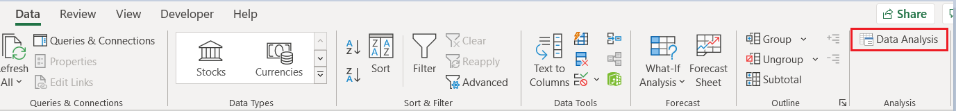
Once we have the TookPak enabled, we should be able to see the Data Analysis option located in the Data tab on the Excel ribbon:
- Perform Regression analysis and interpret the results
For the final part, you do the regression and then see what you got.
Excel Data Analysis with Linear Regression in Example
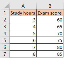
For our purposes, we will create the table with hours spent on learning and student’s exam scores:
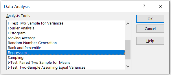
Since we all did steps 1 to 3, we will go to the Data tab, and then click on the Data Analysis. Once we do, we will have a new window on which we will choose Regression as an option:
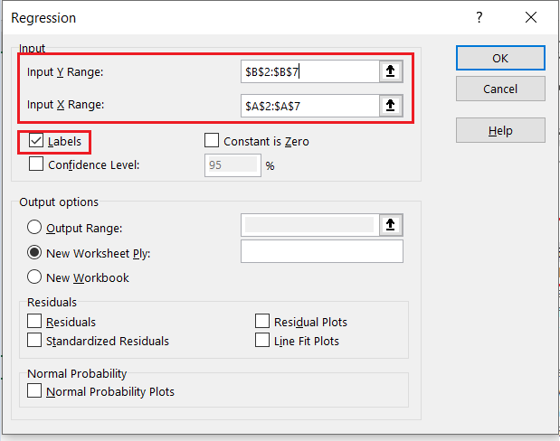
We will click OK and will be presented with a Regression window. There, we will click on the Input Y_Range and then choose range B2:B7 (exam scores) as our Y Range, and on Input X_Range choose range A2:A7 (study hours) as our X range.
We will also click on the Labels checkbox as we have headers:
When we click OK, Excel will create another sheet with the regression analysis done:
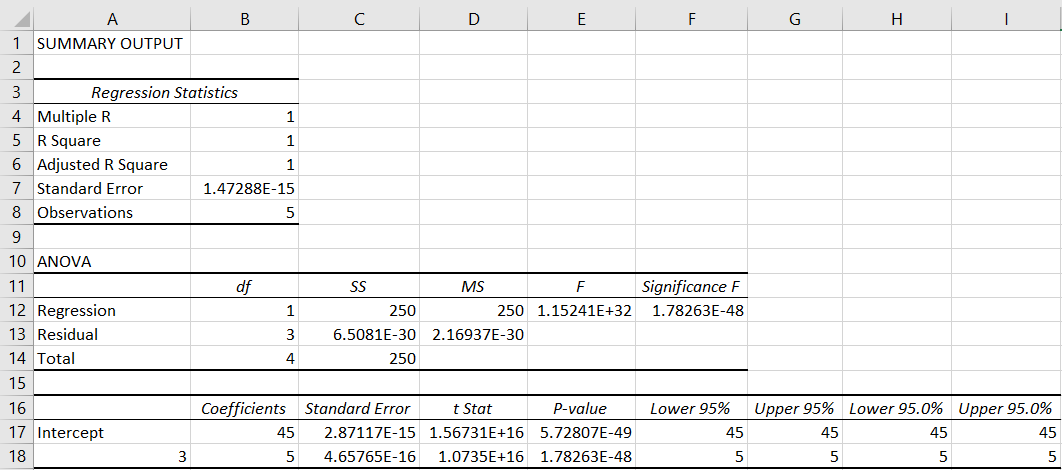
We will have information such as coefficients, standard errors, t-values, p-values, and the R-squared value.
In our example, we wanted to see if there was any correlation between the hours that were put into work, and the scores that students achieved.
The coefficient represents the change in the exam score for every additional hour that students put to work. The p-value is associated with the coefficient and will tell us if the relationship is statistically significant.
R-squared value can give us a good idea about the fit of the model and the data. A value that is close to 1 indicated a good fit, and a value that is close to 0 indicates a poor fit.
In our example, we have a coefficient of 5, which means that, on average, for each additional study hour, the exam score increases by 5 points. Our p-value is smaller than 0.05, meaning that the relationship between the score that students can achieve, and study hours is significant.
This example is fairly simple, and the correlation can be seen by looking at the original table. In real-world scenarios, datasets would be larger, and the models would be more complex. However, the steps that were described above can be applied to these as well.