As with all programs that are active for many years, Excel always brings something new and exciting for its users with the new version. Starting from Excel version 2013 and later, a grouping of Excel charts is available in Excel.
In the example below, we will show how this can be done.
Group Excel Charts Together
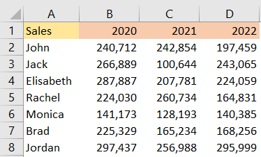
For our example, we will create a table with sales figures for several salespersons, throughout the years 2020-2022:
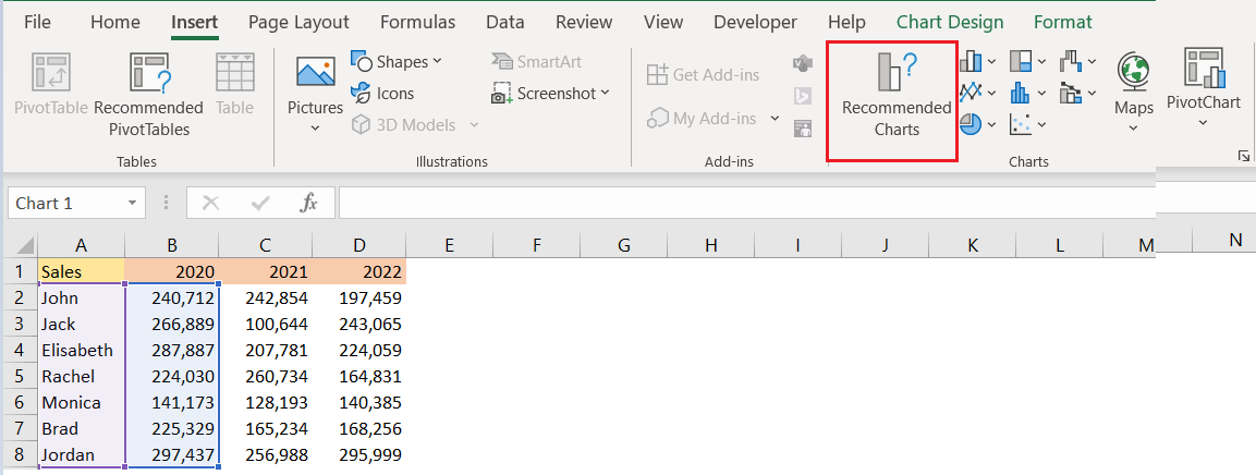
We will create three Excel charts, one for each year, including the names of the salespersons in every chart. We will create the recommended charts, and will do that by selecting the data (columns A and B for the first chart, starting from the second row) and going to the Insert >> Charts >> Recommended Charts:
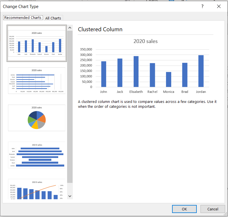
We will choose Clustered Column chart– the first one that is recommended, and then we will click OK:
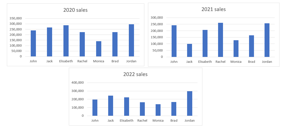
We will do the same thing for the other two charts, combining column A with columns C and D. We will end up with three charts:
In order to group these charts, will do the following steps:
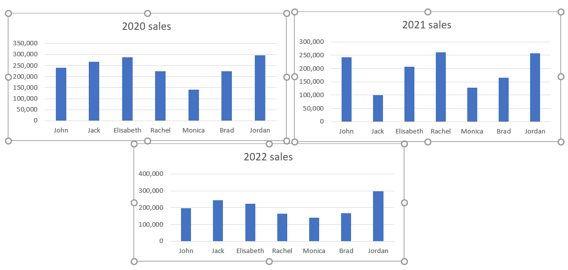
- Choose the first chart to be grouped by clicking on it.
- Press and hold the CTRL key on the keyboard in order to select the other charts that will be grouped. We will click on every chart while holding CTRL to select more than one chart:
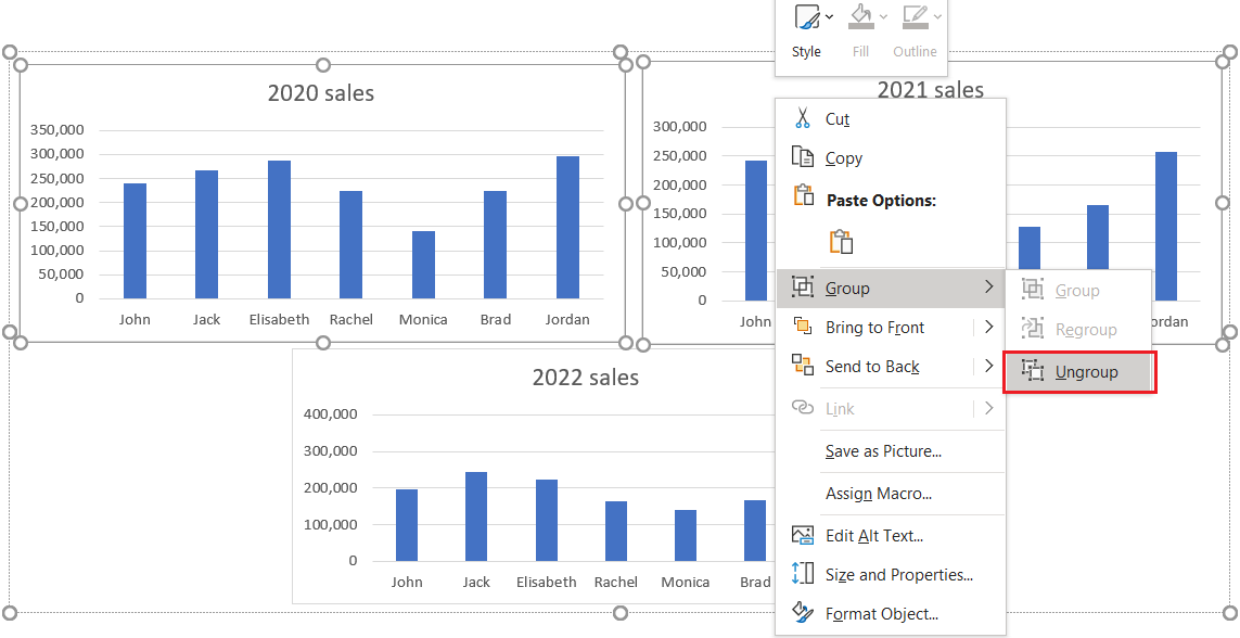
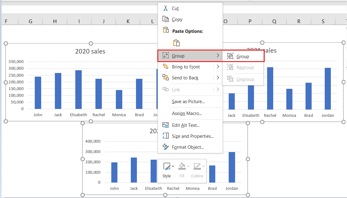
- When we finish with the selection, the next step is to right-click on these charts, and choose the Group option from the menu:
Our charts will be grouped, and we will get a border around these charts:
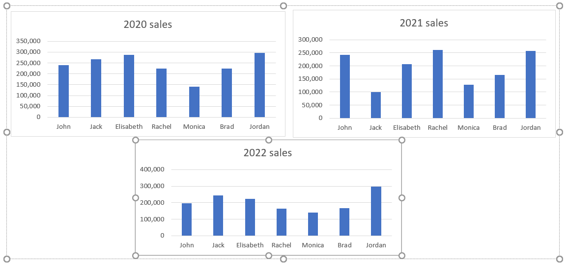
Once we have the data grouped, we can move them, resize them or format them all together simultaneously.
To ungroup these charts, we can right-click on any of these grouped charts, and choose the Ungroup option. We can also click CTRL + SHIFT + G to achieve the same thing. Once we do that, we can manipulate the charts individually: