Merging two charts in Excel can make it easier to analyze data because we can see many aspects of the data simultaneously. This tutorial shows two techniques for combining two charts in Excel.
How to Merge Two Charts in Excel
We can use the following two methods to merge two graphs in Excel.
Method #1: Use the Copy and Paste Method
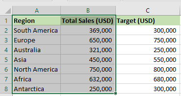
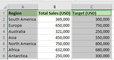
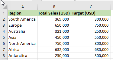
Let’s consider the following dataset showing the regional sales of a particular telecommunication company. The dataset also shows the target sales for each region.

We want to create two charts based on the dataset and then show how to merge the two charts.
Create the Two Charts
We use the following steps to create the first chart:
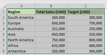
- Select cell range A1:B8.
- Click Insert >> Charts >> Recommended Charts.

- On the Insert Chart dialog box, on the Recommended Charts tab, select the first Clustered Column and click OK.
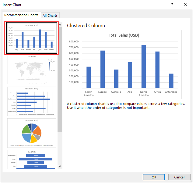
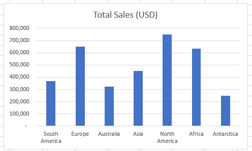
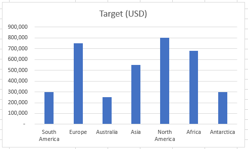
The first chart, Total Sales (USD), is created.
We use the following steps to create the second chart:
- Select the cell range A1:A8.
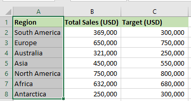
- Press and hold down the Ctrl key and select the cell range C1:C8.
- Click Insert >> Charts >> Recommended Charts.

- On the Insert Chart dialog box, on the Recommended Charts tab, select the first Clustered Column and click OK.
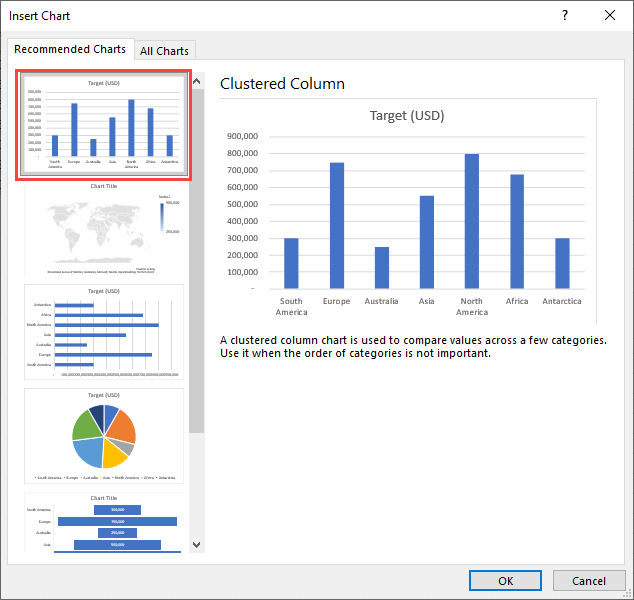
The second chart, Target (USD), is inserted into the worksheet.
Merge the Two Charts
We merge the first and second charts by using the following steps:
- Select the first chart, Total Sales (USD), and press Ctrl + C to copy it.
- Select the second chart, Target Sales (USD), and press Ctrl + V to paste the first chart.
The two charts are merged.
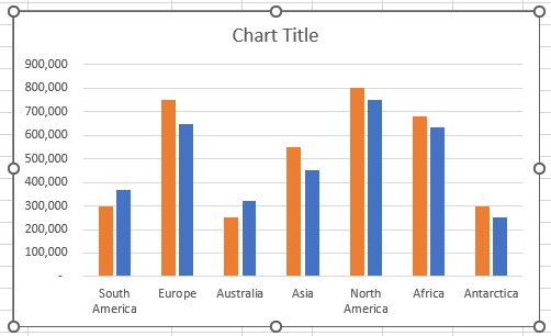
- Select the chart title and change it to “Total Sales Vs. Target Sales.”
- Click the Chart Elements button on the top right corner of the chart, click the right arrow next to the Legend option, and choose Bottom on the submenu.
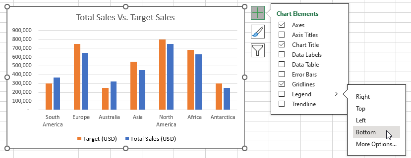
A chart legend is added to the bottom, indicating that the orange data series represent the Target (USD) and the blue data series represent Total Sales (USD).
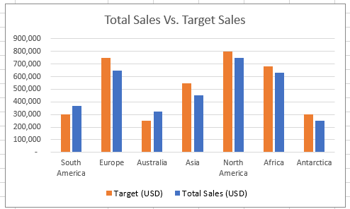
From the merged charts, we can quickly observe that only South America and Australia exceeded the target sales. All the other regions’ sales were below target.
Method #2: Use a Combo Chart
In Excel, a combo chart combines two or more chart types in a single chart.
We use the following dataset to show how to create a combo chart in Excel.
We use the following steps:
- Select the entire dataset.
- Click Insert >> Charts >> Recommended Charts and select All Charts on the Insert Charts dialog box.
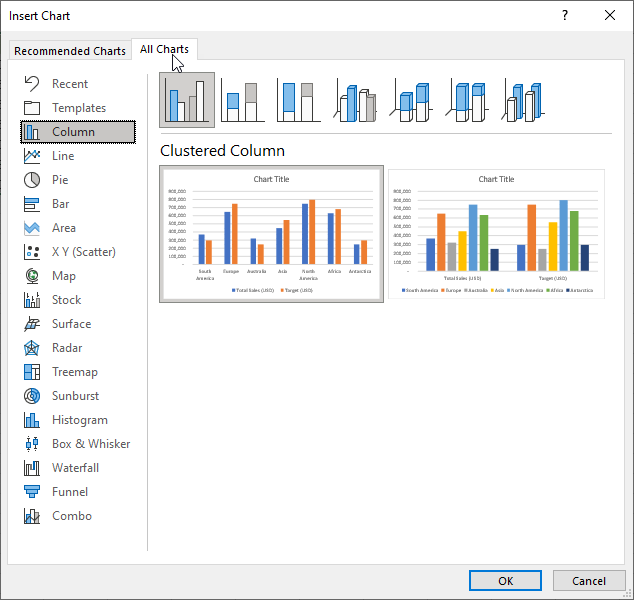
- Choose Combo on the list on the right and click OK to insert the Clustered Column – Line chart.
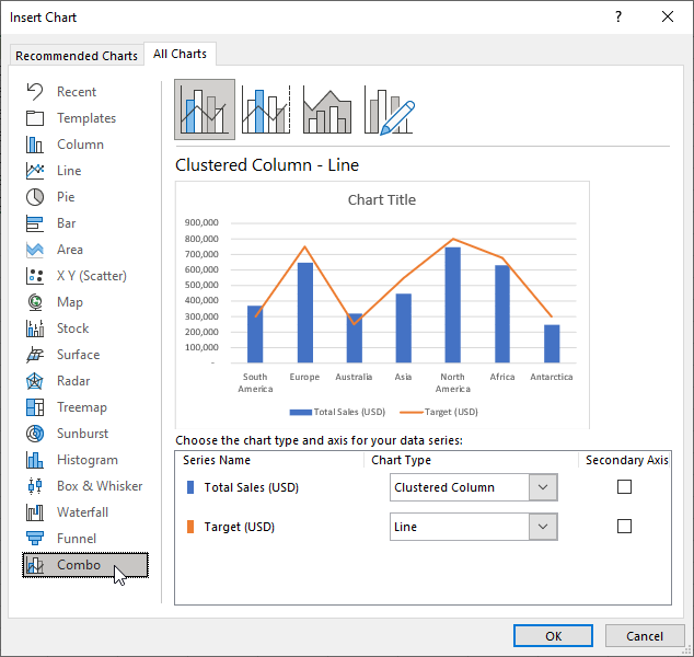
- Change the inserted graph’s title to “Total Sales (USD) Vs. Target (USD).”
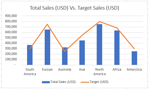
The combo chart is inserted with a legend at the bottom.
Conclusion
This tutorial showed two techniques for combining two charts in Excel. We hope you found the tutorial helpful.