A good way to use a pie chart in Excel is when you want to show relative proportions to a whole. A pie chart should use between two and six data points- too many slices may make it difficult to interpret. It can only display data that belongs to one data series, and each of its values must be positive.
Types of pie charts
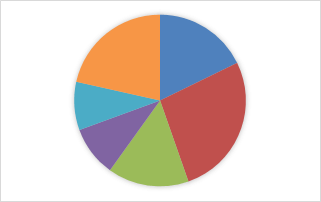
Standard Pie Chart
This is standard- the most popular pie chart. You will probably use this chart most often.
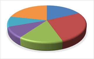
3-D Pie Chart
This pie chart is shown with the appropriate perspective. When you use the 3-D Pie Chart you will get access to additional tools, such as 3-D rotation and Perspective, which is not available in the standard 2-D chart.
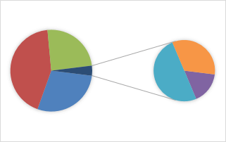
Pie of Pie Chart
When a pie chart has many small parts, you may want to display them on a second pie chart, which is a slice of the first one.
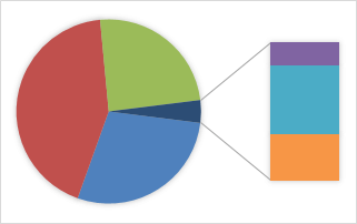
Bar of Pie Chart
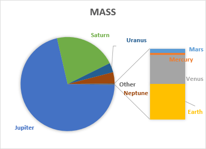
Bar of Pie chart is similar to the Pie of Pie chart. The difference is that the selected slices are displayed on the Bar chart instead.
Doughnut Chart
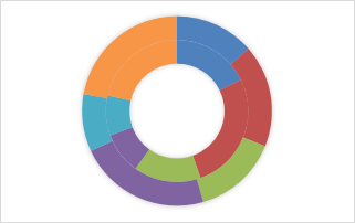
If you have more than one data series you can use this type of chart.
TIP
When you have more than one data series it is recommended to use other charts, instead of the doughnut chart because it’s hard to see proportions between elements in a different series.
Creating a Pie Chart
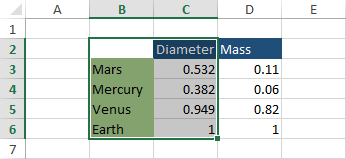
Before you create a new Pie Chart in Excel, first you need to select the data from the table. In our case, it will be cells from B2 to C6.
Go to INSERT >> Charts >> Insert Pie or Doughnut Chart and click the first item, which is the standard Pie Chart.
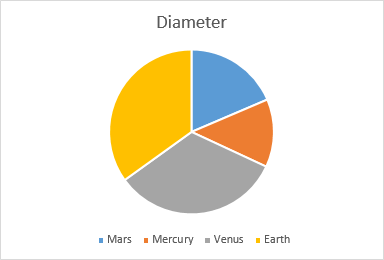
Take a look at the newly created pie chart. It has a legend but doesn’t have labels. I will show you how to add and manipulate labels in the next Excel lessons.
NOTICE
By default, the first part of the chart starts at the 12 o’clock, and another “slices” appear in a clockwise direction.
Formatting a Pie Chart
We will add some data labels to our chart. First, click the chart, then click the first of the three icons that are located on the right side of the chart; A new menu will appear. Check the Data Labels position and click the arrow to the right. This will open a contextual menu. Here, you can select where the item should be placed.
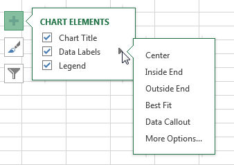
The first four positions represent locations you can choose to place data labels. Fifth position- Data Calloutdisplays data labels inside text bubbles.
Because next to each value there is also a category name, the legend is no longer necessary. You can remove it because it doesn’t make sense to duplicate information.

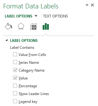
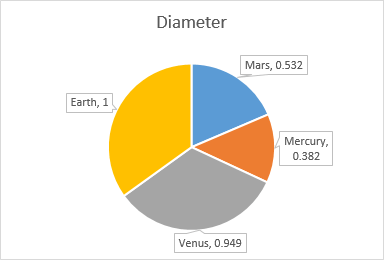
Let’s suppose that instead of percentages in the data labels you want to see the values from the table. To change this, right-click the data labels and select Format Data Labels…; The LABEL OPTIONS menu will appear. Uncheck Percentage and check Value.
This will give the following effect:
Rotating a Pie Chart
There is a controversy whether or not rotate a pie chart in Excel. Many people think that the first slice should always start at 12 o’clock, and other slices should appear in a clockwise direction. However, a good method, especially when you’re dealing with lots of tiny parts is to start displaying them, not at 12 o’clock, but at 3 o’clock, starting with the smallest slices. Thanks to this method you have a lot of space on the data labels so they won’t overlap.
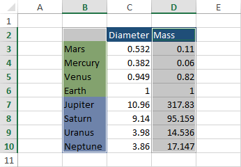
Look at the following example. It shows mass and diameter of all planets in the Solar System.
To create a chart, first, select the names and masses of the planets.
After you insert a Pie Chart, click it, then in Chart Elements select Data Labels.
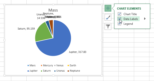
As you can see the planets with the lowest mass get the smallest slices. It’s a good decision to turn the chart by 90 degrees clockwise so you can have more space for data labels.
Right-click the pie chart to select it and choose Format Data Series…. Set the angle of the first slice to 90 degrees.
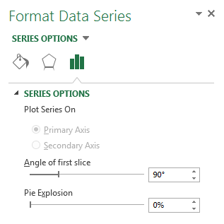
If some of the labels overlap, grab them and move to the proper position.
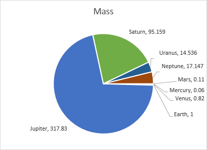
Note that, in this case, the masses of the Earth, Venus, Mars, and Mercury are smaller than the spaces between the slices. You can change it by selecting different chart style in CHART TOOLS >> DESIGN >> Chart Styles.

Now you can barely see slices for Earth and Venus. But still cannot see for Mercury and Mars.
Pie of Pie and Bar of Pie Charts
If you have a group of small, barely visible pie slices and you want to show relations between them, a good idea may be to use one of two types of charts: Pie of Pie or Bar of Pie. Both charts display a slice of a pie chart inside another chart.
Example:
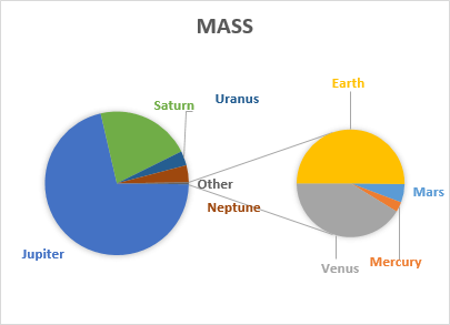
In the previous example, planets such as Earth, Venus, Mars, and Mercury occupied only a small part of the pie. Therefore, in the following example, these planets will be shown in a separate chart in order to see exactly the relationship between their masses.
To display them in the separate chart, right-click the chart and select Change Series Chart Type…. or go to CHART TOOLS >> DESIGN >> Types >> Change Chart Type.
This will result in the following chart.
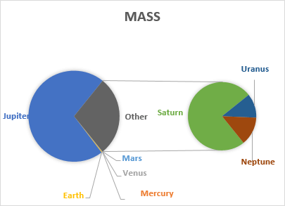
This is surely not what we expected. The second chart consists of 3 gas giants (Uranus, Saturn, Neptune) instead of the rocky planets (Mercury, Mars, Venus, Earth).
Let’s make some fixes. First, right-click one of the charts and select Format Data Series….
A new menu will appear.
Change Split Series By to Value and set the Values less than to 1.01. We need to change it to this value because Earth mass = 1 and we want also have Earth in the chart.
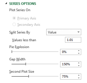
After the changes, our charts will look like in the picture below.
CAUTION
If some of the labels aren’t visible they are probably under the chart. Just drag them out and place outside the chart. If you don’t want to see a pie chart as the second chart you can use the Bar of Pie Chart instead.
3-D Pie Charts
To change a 2-D pie chart to 3-D pie chart in Excel, go to CHARTS TOOLS >> DESIGN >> Type >> Change Chart Type and select 3-D Pie Chart.
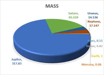
3-D pie charts have the advantage over 2-D pie charts because you can set options there that are not available in 2-D charts. One of them is Y Rotation.
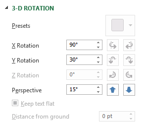
In order to use this option, right-click the chart and choose 3-D Rotation. Y Rotation is set, by default, to 30 degrees. You can set it between 0 and 90 degrees, where 90 degrees is the view from the top.
TIP
You can also use perspective in 3-D charts, but I don’t recommend this because it will be hard to distinguish between sizes of individual slices.
Exploding a Pie Chart in Excel
In order to distinguish a slice of the pie chart, you may want to pull it outside of the chart.
Click the chart (don’t release the button) in order to select all the slices. If you move the mouse cursor outward, all of those slices will start moving apart.
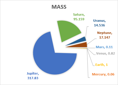
If you want to pull out only one element of the chart, click it, wait a while and then start dragging it outside of the chart.
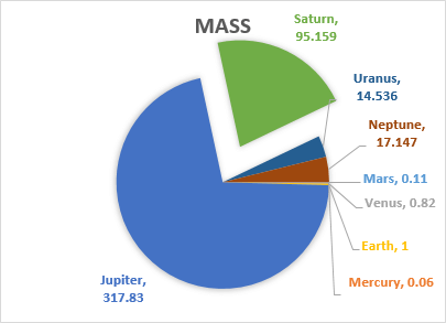
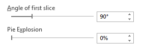
If you want to have more control over the distance between the slices, click the chart or a single slice. Right-click to open the contextual menu, then select Format Data Series…. Here, you can set precisely the percentage of the pie explosion.
TIP
You can use values between 0% and 400%.
